The story of fashion is the story of colour, and yet the relationship between these two worlds is so rarely explored in depth. The instinctual and emotive response we have to colour as humans has outlasted the artisanal methods originally used to colour fabrics certain shades, and as digital technology continues to cheapen and improve printing and fabric production techniques, so has colour in fashion become democratised.
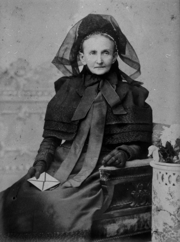
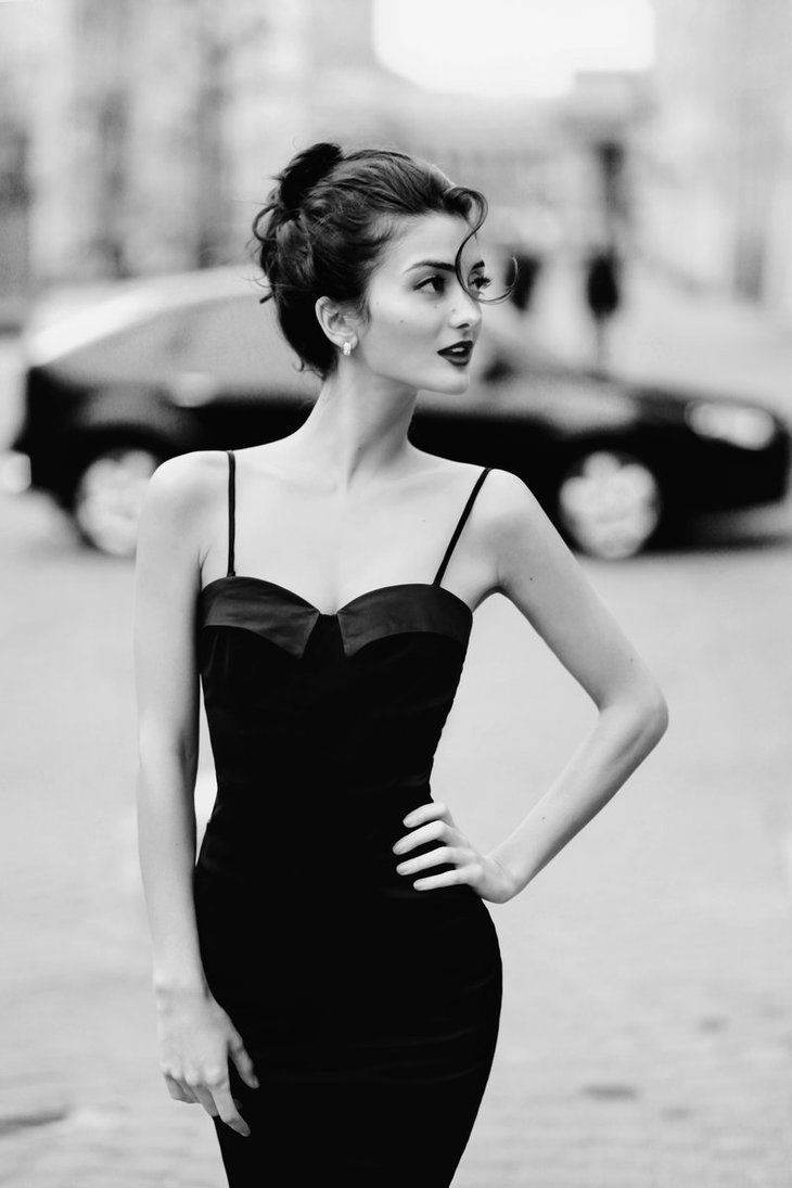
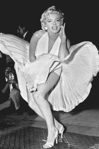
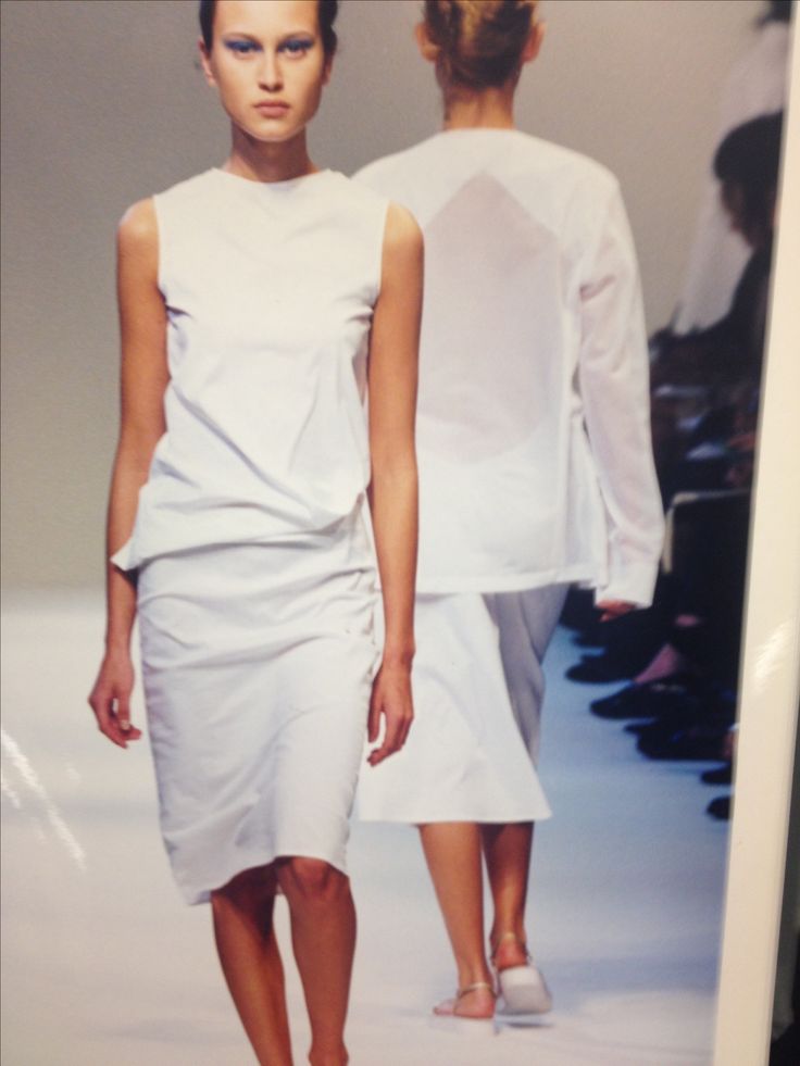
In addition to this, colour shifts in symbolism. Black, once funerary, becomes elegant and the height of fashion at the hands of Coco Chanel. White, a colour so historically entwined with the concept of purity, virginity and classic femininity, transforms into a sex symbol when donned by Marilyn Monroe, or becomes modern and cool in the sleek minimalist fashion of the 1990s.
Example of a colour tone forecast (AW 2017) from the Pantone Institute.
These changes in meaning also touch every colour in the spectrum between black and white. Colour in fashion is heavily contextual. It is influenced and driven by social, cultural and even political events and phenomena. There is no straightforward “colour system” in fashion - rather, colour in clothing can be seen as a dialogue where many different factors interact to drive seasonal trends and cement iconic moments in fashion history.
RED
Red is a strong colour and it carries with it equally strong connotations. Red is the colour of blood and the heart, associated with power, lust, anger and sensuality. It is the colour of the cupid and of the devil. It mobilises human attention, which is why emergency vehicles such as fire trucks are red. From a physiological perspective, it can elevate blood pressure, enhance libido, increase enthusiasm and confidence.
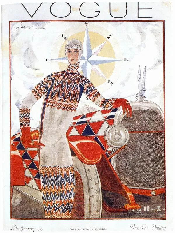
It is therefore unsurprising that red has been a mainstay of the catwalks and of iconic fashion imagery for the past few years. But this wasn’t always the case. After the first world war, red still had traumatic connotations - Vogue in 1925 stated that red had ‘a touch of the soldier’s swagger… of flaunting danger’, implying that red was a colour still symbolically tied to military violence and the recent experience of the war.
Vogue Cover, 1925.
But that was in Europe - In some eastern cultures, red has been a celebratory colour for many years. It is still a traditional wedding dress colour. It represents prosperity and good luck in China, and fertility in Hindu culture where it is equally associated with love and passion.
A red that stands for lust and sensuality is Dior’s iconic lipstick that “dressed the woman's smile” according to a 1953 advert. It is this same sensuous red that accompanies the mythology of Christian Louboutin’s footwear. The signature red Louboutin soles accompany vertiginous heels that are overtly sexual in shape, with slim stilettos and excruciatingly sharp pointed toes.
Valentino Garavani and his muses in the brand’s signature red.
Valentino red is one of the most well-known brand associations with red, albeit less so than Dior and Louboutin that are more instantly recognisable and interwoven with the brands’ marketing messages. The unusual shade of bright red mixes carmine, purple and cadmium and was inspired by a trip to Spain, where Valentino Garavani was taken aback by the dresses worn by Opera singers in Barcelona. He incorporated this shade into almost all of his catwalks and the creative directors following him have ensured this trademark is not lost.
Scarlett O’Hara in Gone With The Wind.
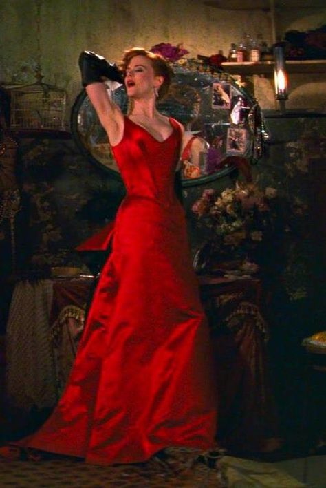
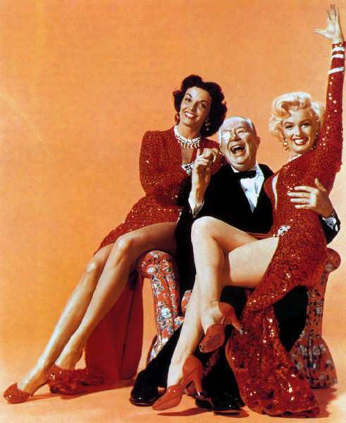
The red dress, perhaps more so than the little black dress, has always been synonymous with elegance and provocation - think of Scarlett O’Hara in Gone with The Wind in her shimmering red gown or Marilyn Monroe and Jane Russell in sequinned scarlett in “Gentlemen Prefer Blondes”. More Recently, Nicole Kidman in The Moulin Rouge embodies the passion and sensuality of the colour. Red never goes out of style, and strong brand associations with the colour ensure it is never far from the catwalks or from the mainstream retail environment.
(Left to right) Marilyn Monroe and Jane Russell in sequinned scarlett in “Gentlemen Prefer Blondes,” Nicole Kidman in Moulin Rouge.
Audrey Hepburn in her iconic little black dress.
BLACK
Black is the absence of colour and it carries with it this stigma. It is often associated with the unknown, with negativity, with emptiness. And yet through its trajectory in fashion it has also come to represent sophistication and sensuality. It is the base colour that gives depth or emphasis to other hues within a collection, and it is widely known to be universally flattering.
Paula Prentiss in Man’s Favourite Sport, 1964.
Black was the dominant colour for evening wear in the 1950s as it emphasised the feminine silhouette which was particularly helpful in black and white cinema. The actresses movements were clearer against bright interior spaces and their hourglass figures were brought visually to the fore.
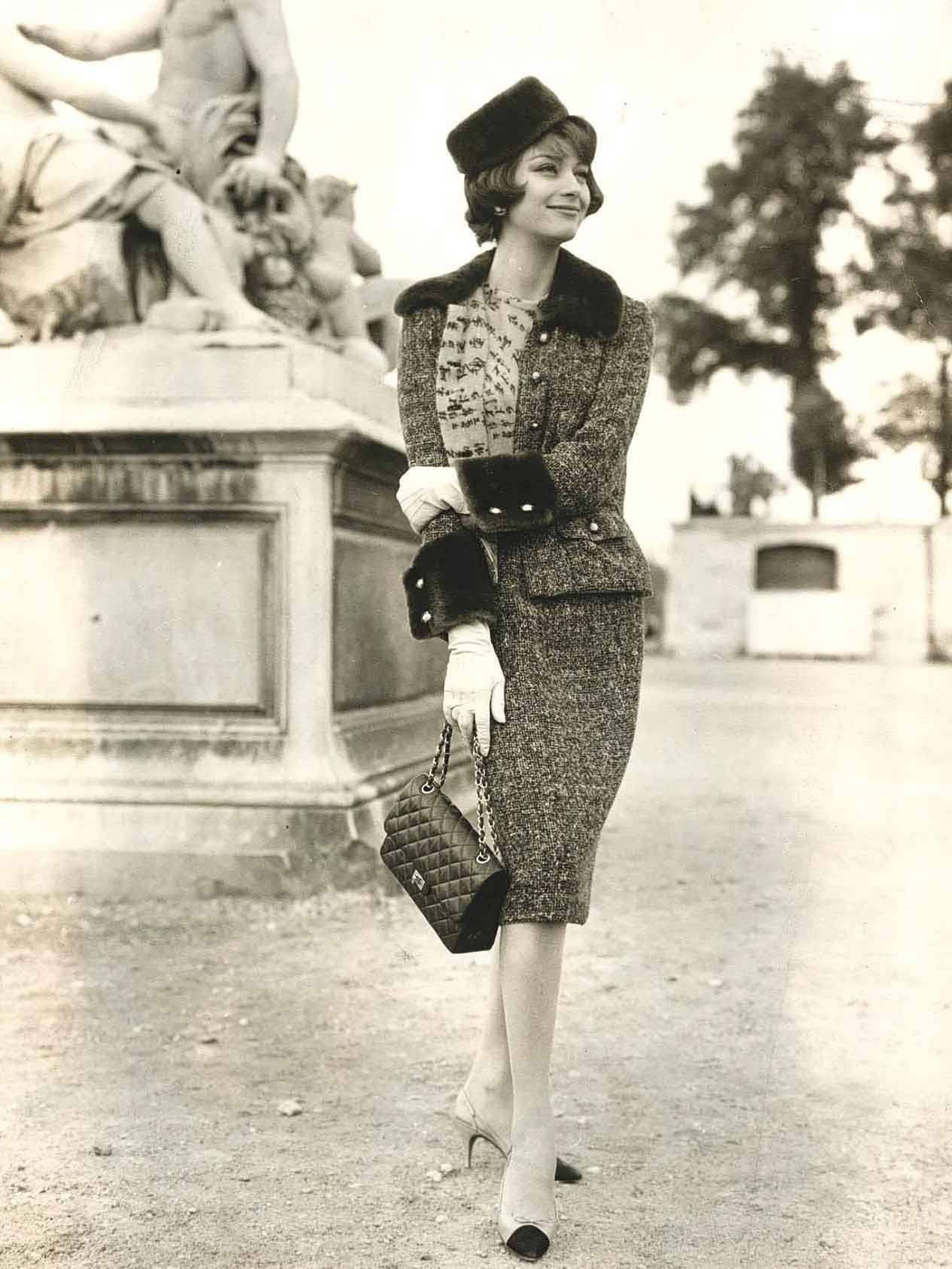
The Chanel 2.55 bag.
Black was first turned from colour of mourning and wartime misery to colour of the moment by Gabrielle “Coco” Chanel. This is best epitomised by the 2.55 bag which was first produced in 1955, once Chanel had reopened its business after the war. The quilted exterior was inspired by the jackets worn by stable boys at the races. In 1955, the bag was made in Coco Chanel’s favourite four colours: black, navy, beige and brown and to this day the black version (with the signature gold chain handle) remains an international bestseller.
The natural accompaniment to the bag is the Little Black Dress first presented by Chanel in 1927 - described at the time by American Vogue as “The Chanel Ford: the frock that all the world would wear.” The little black dress marked the start of the subversion of the symbolism of black to represent versatility and power.
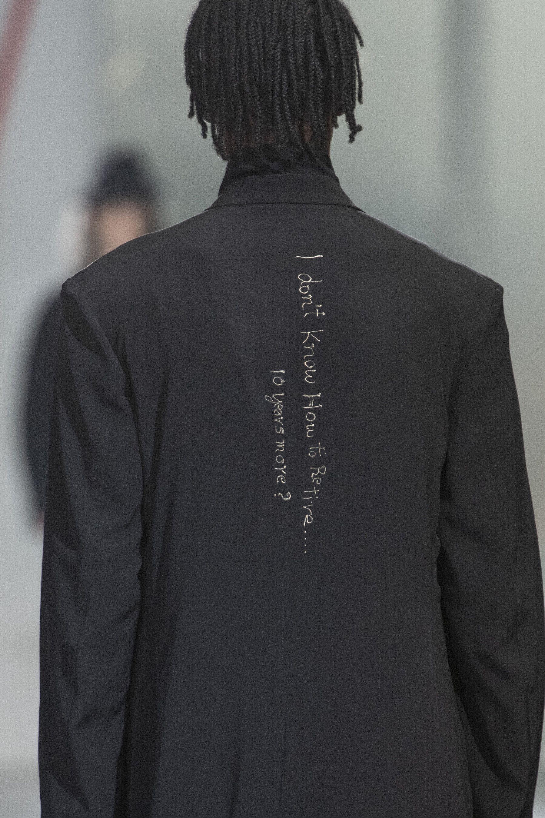
Black in modern fashion is often used as a conceptual statement. Black is seen as a cerebral colour - associated with intellectuals, poets and artists. It connotes seriousness and diligence. Japanese designers such as Rei Kawakubo of Comme Des Garcons and Yohji Yamamoto use black in many of their avant garde collections, embracing the floating space between its air of monasticism, androgyny and nonchalance.
Yohji Yamamoto, Menswear SS2020
When asked about his predilection for black, Yamamoto explained “Black is modest and arrogant at the same time. Black is lazy and easy — but mysterious….Black can swallow light, or make things look sharp. But above all black says this: ‘I don’t bother you — don’t bother me!'”
PURPLE
Historically speaking, purple was a colour reserved for royalty - because it was such a laborious shade to create. The legend goes that Cleopatra needed 20,000 snails soaked for 10 days to obtain just an ounce of purple dye for her royal robes. And royalty and purple have stayed closely linked up until the advent of industrial dying methods at the end of the Victorian era. In Ancient Rome, the emperor has vibrant purple robes whereas senators had to make do with a solitary stripe on their official ‘uniforms.’
Mosaic of the Emperor Justinian
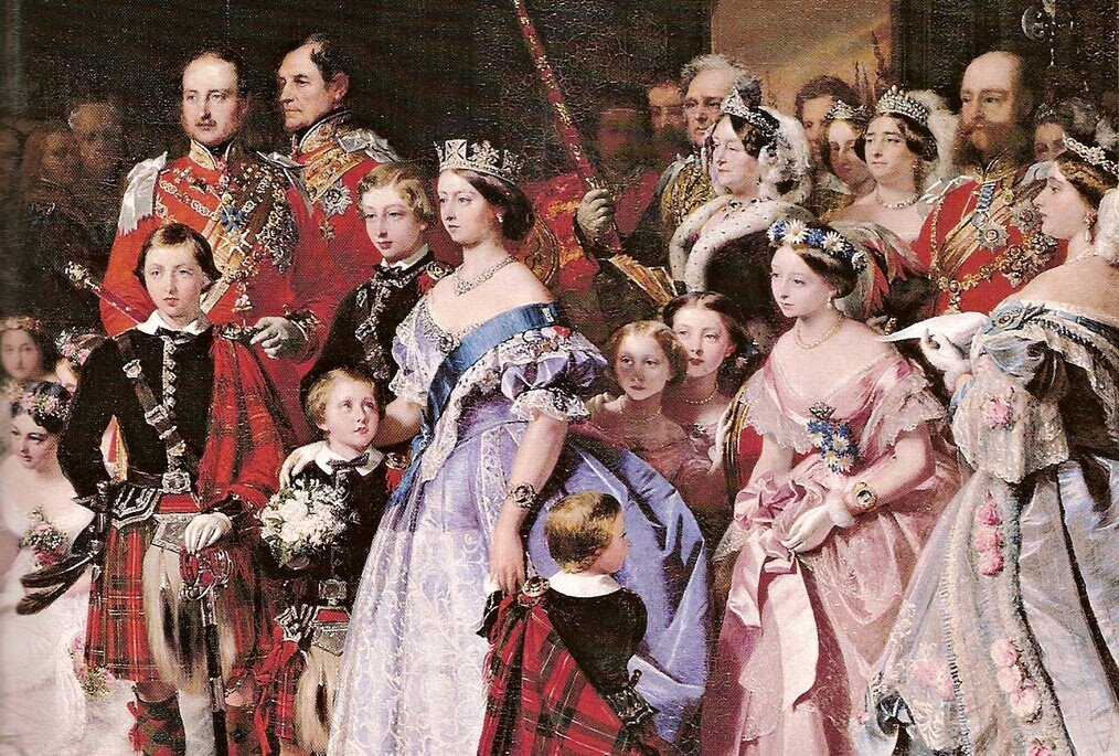
Queen Victoria, often depicted as short, frumpy and dressed in severe black, is an unlikely style icon. Yet the dress she wore to her daughter’s wedding in 1858 caused a style frenzy due to its unusual colouring! It was a shade of lilac purple, the result of a botched experiment by a student at the royal college of chemistry.
J. Phillip’s Marriage of the Princess Royal, 1860
While trying to invent an anti-malarial drug, William Perkins noticed that the formula in use had stained a cotton rag in a gorgeous purple tone. He did what any self respecting aspiring scientist would do… and decided to abandon his quest for a cure and instead commercialised his discovery by opening a dye company. This shade of purple was nicknamed the queen’s lilac and its popularity was such that magazines complained of a “mauve measle” epidemic amongst women.
PINK
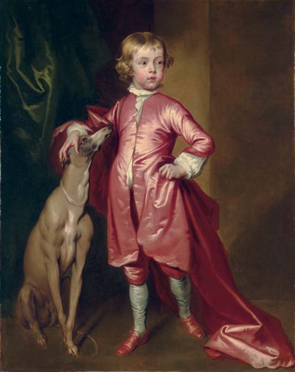
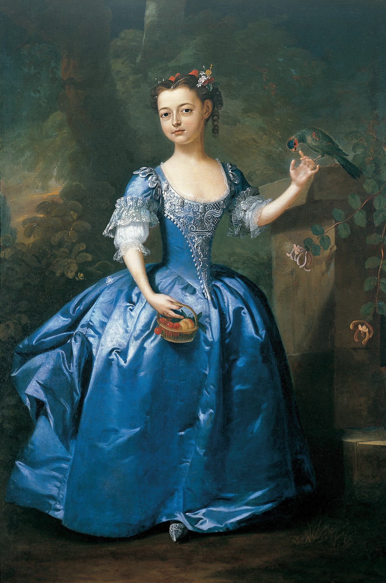
Pink has come to represent everything that is quintessentially girly. Barbie, the most famous doll in the world, has a notoriously pink-tinted life. In Legally Blonde, a stereotypical “ditzy” sorority girl, Elle Woods, often dresses in her signature bright pink. Pink is also a highly politicised colour which makes it interesting to examine. Pink was historically a masculine colour - as a paler version of red, it had associations of blood and fighting whilst blue (the colour associated with the virgin Mary) was seen as more feminine.
Left: John Vanderbank, 1694. Right: Willem Verelst. Portrait of a Girl in a Blue Dress with a Parrot in a Palatial Garden. Ca. 1730
The swap that occurred was the result of a gradual evolution catalysed by changes in the clothing industry and the burgeoning era of mass production. By the 1950s, most families bought clothing from shops. The more baby clothing could be designed for an individual child - as opposed to neutral garments to be shared between siblings - the harder it would be to hand down clothing from one child to the next which forced families to consume more clothing a they grew. Distinguishing them by gender was simply the most obvious way of going about this.
Advert for the Shcoking de Schiaparelli perfume, ca. 1938
In more recent times, Schiaparelli had come to personify the vivacity and playfulness of pink. The bitter rival of Chanel, Schiaparelli ended up trademarking a hot pink colour which became the namesake of her first fragrance and graced all of her branding. This shade appears time and time again in her collections, injecting a heady dose of confrontational colour into outfits that look far beyond their time.
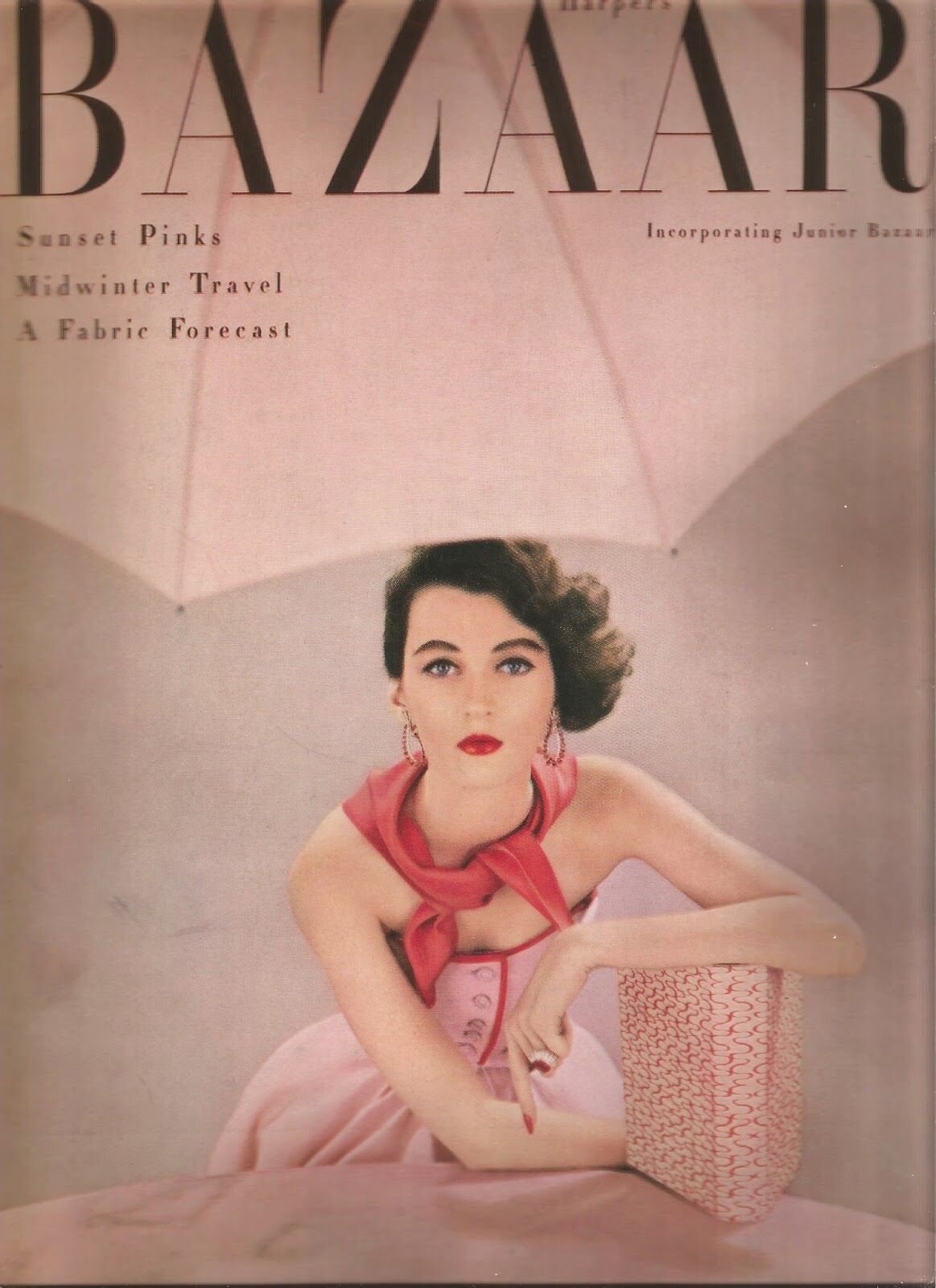
In the 1950s, the editor-in-chief of the glossy fashion bible, Harpers Bazaar, was pressured by an important advertiser to push ‘sunset pink’ as part of a marketing campaign to launch a new train (yes, a railway train!) entitled the Sunset Limited. It was an example of a company attempting to ‘plant’ a trend in a fairly clunky and inorganic way and to bypass the normal workings of the fashion system.
Not only did consumers fail to buy into this fairly obvious publicity stunt, but it prematurely ended Carmel Snow’s position as editor in chief. This disaster inspired the opening sequence of “Funny Face” - a catchy song entitled ‘Think Pink.’
Harpers Bazaar ‘Sunset Pink’ issue, 1951.
Funnily enough, sunset pink appears to have graced us more recently in the fashion realm, in a slightly cooler tone. Millennial pink is not only a fashion trend but has become a term associated with the commodification of political concepts such as radical feminism, corporatised by brands and sold en-masse to a digital generation keen to reclaim the delicate shade to mean something far more bold and brave than its traditional connotations.
Marc Jacobs SS2019
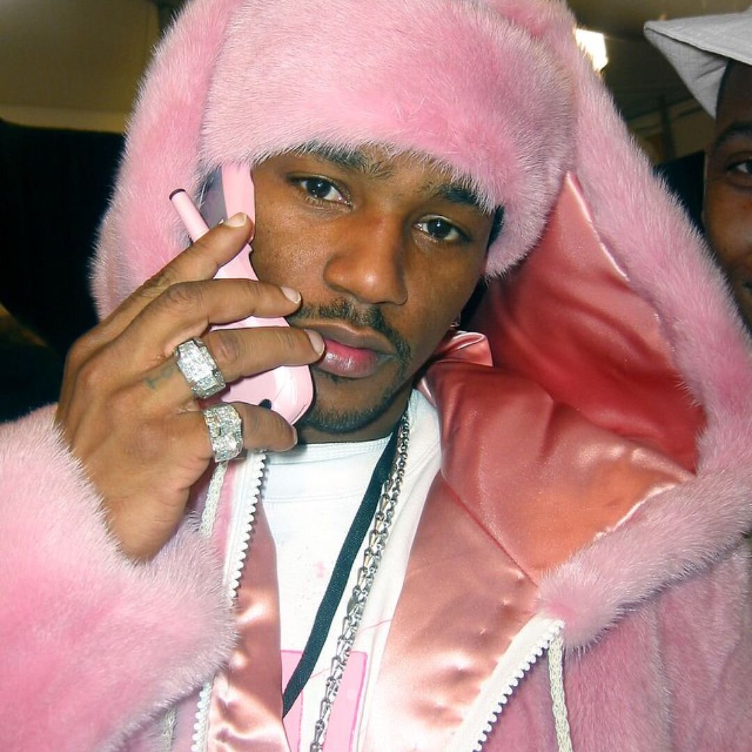
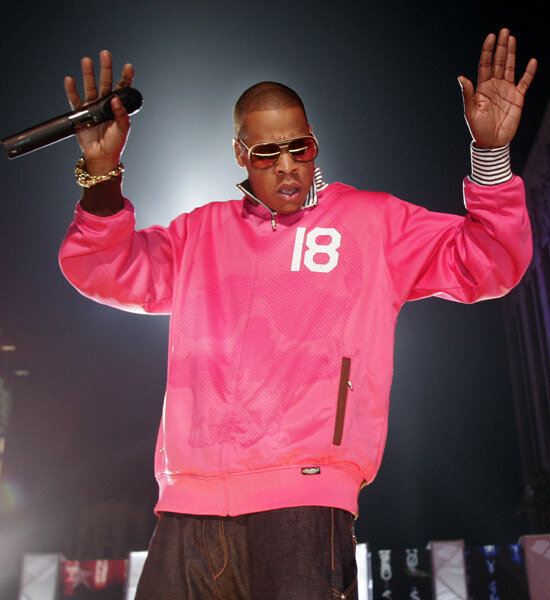
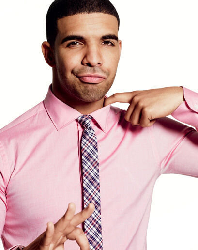
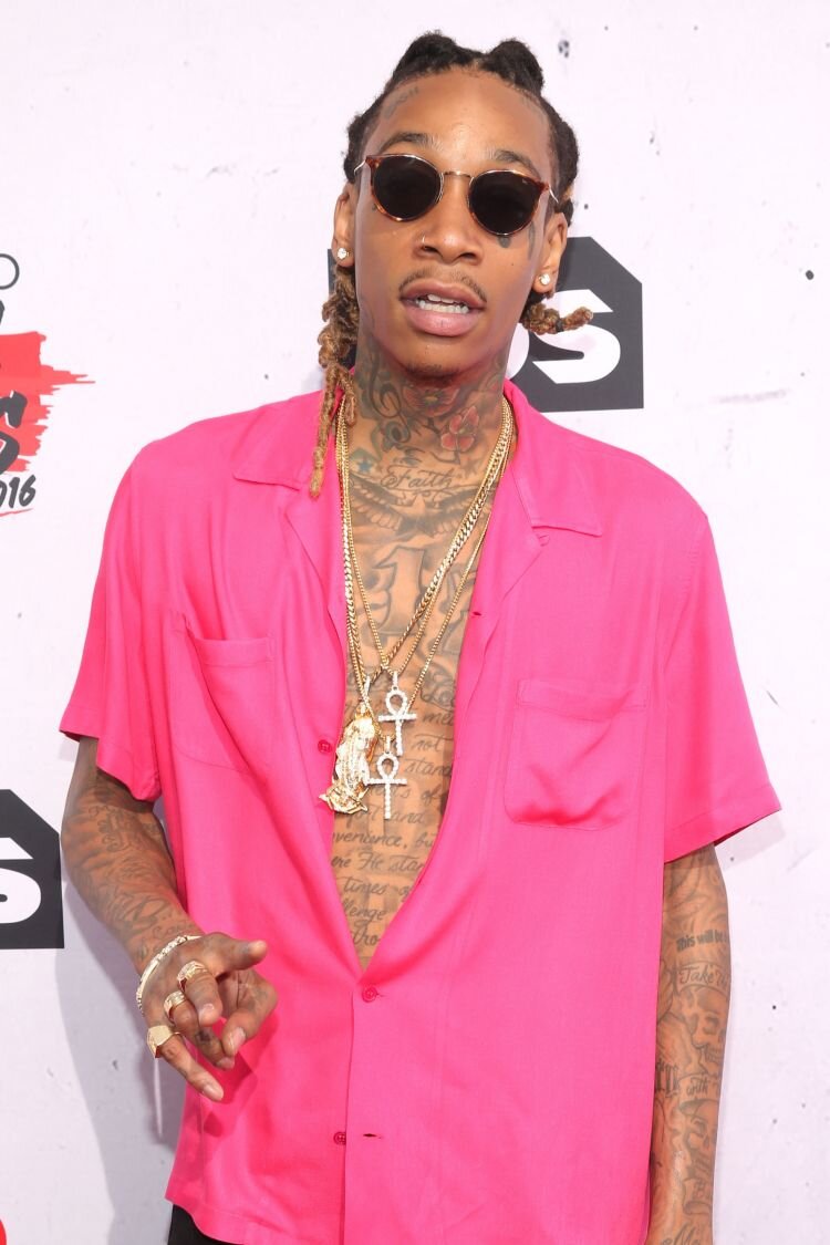
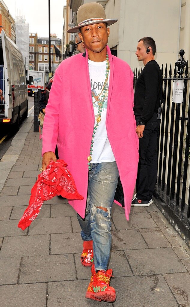
From the 90s onward, the world of hip hop has used pink to challenge the public’s perceptions. Rappers and hip hop artists generally portrayed as ‘tough’ and traditionally masculine adopted pink into their day to day and professional wear. It shows a willingness to subvert the colour and their own carefully branded images as ‘fearsome’ and ‘hyper virile’, echoing a desire of society at large to re-evaluate gender norms and question why certain trends are reserved for those who act in certain ways. It seems like the stigma of pink is being slowly but surely lifted…
Millennial pink is still omnipresent which only points to its mass appeal as both an appealing colour to commodify, but also as a colour which still feels like a bit of a cultural battleground in 2020.
NUDE
Nude is neutral. Nude is sensual or scaled back, depending on how it is styled. During world war 2, women often collected nude and cream coloured parachute silk to make clothing out of - sometimes even running towards downed planes to cut off the fabric to reuse.
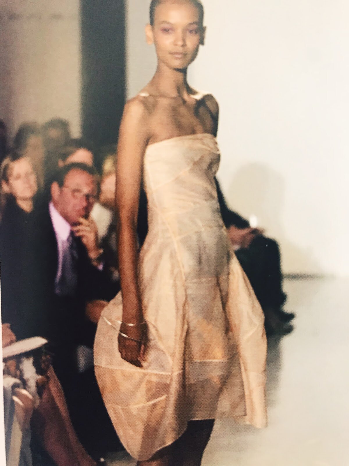
Donna Karan parachute silk dress, ca. 1990
Donna Karan used parachute silk (which was usually actually a blend of silk and nylon) in her stark but structural collection to create diaphanous and gossamer-light silhouettes. And of course, when nude nylons were in short supply during the war, women turned to gravy granule powder to recreate the effect of stocking seams.
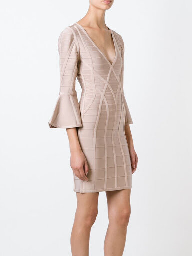
In a globalised world it is problematic to consider a Caucasian skin colour as ‘nude’ - but for now, the word tends to remain associated with a soft pinkish hue with beige undertones. Popular for undergarments and stockings at the turn of the century, its resemblance to the unclothed body made it a provocative choice for modern designers experimenting with simplistic outwear that clings to the body in a sensual way.
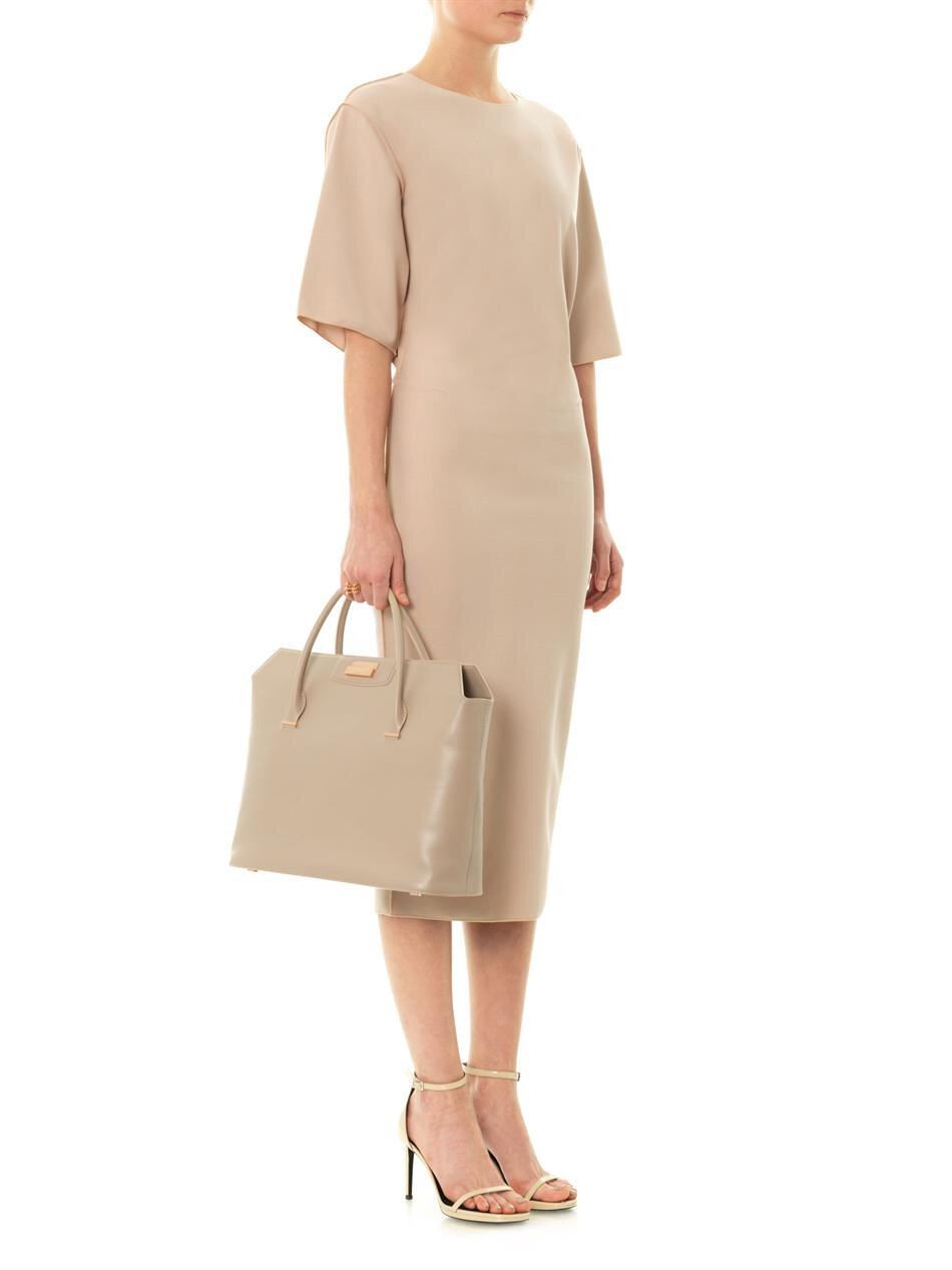
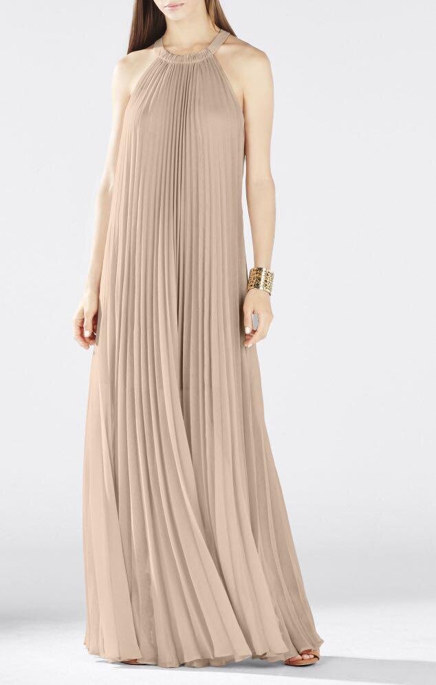
From left to right: Max Mara dress, BCBG Max Azria dress, Herve Leger dress
Herve Leger, Max Mara and BCBG all embraced the colour which fluctuates from sex symbol in strappy, tight-fitting dresses to the ultimate statement of minimalism and anti-fashion in looser fitting garments that hang off the body with simplistic clean lines.
ORANGE
Orange is a colour that is often left out of conversations surrounding fashion, which seems bizarre, as Parisian luxury retailer Hermes has adopted it as its signature shade. In fact, Hermes orange is widely considered one of the most distinctive and instantly recognisable colours in retail.
Hermes Paris packaging
Carolina Herrera, an American designer famed for her understated but elegant outfits, once called “orange the new red.” and Orange is still a relatively young colour, until about the 16th century it was referred to in English as red or saffron. This might explain why it feels so modern, and why there is still so much ground to explore with orange from a fashion perspective.
Raf Simons during his time at Jil Sander used orange as an exclamation point in an otherwise extremely pared back and sculptural collection, completely devoid of print and fuss. What is interesting is he uses different tones of orange rather than a solid shade, moving away from the idea of a ‘signature’ colour for the collection and using it as a joyful detail and addition to clothing so measured and deliberate in its simplicity.
Henry VII
When orange fabrics were first available to buy in western Europe, the renaissance elite clamoured to obtain it. As tastes evolved and became more understated - orange became a statement shade that bohemians and artists used to create a dramatic effect, and perhaps channel some of the exoticism associated with the east that inspired so many of them. The dress on the right was designed by artist Sonia Delaunay and echoes the motifs on a Grecian urn, with a sunset-inspired colour palette).
Sonia Delaunay, Costume for the ballet Cleopatra, 1918.
Jean-Paul Gaultier, who began his career by sending in his home-drawn fashion illustrations to Pierre Cardin, created one of his most iconic pieces in mandarin orange velvet - the conical breast corset dress. Inspired by queer culture, it was spotted by Madonna who shared his fascination and appreciation for underground gay culture and this secured Gaultiers’ status as a household name. It is easy to see why he chose such a bold shade to accompany such an outlandish design, as it only served to enhance and exaggerate its wild and cartoonish silhouette.
Jean Paul Gaultier’s conical bra in orange velvet, 1984
YELLOW
Yellow is an energetic colour - full of bounce and optimism. It was historically a favourite contender for the wedding robes of ancient Romans and in the 20th century was used to make bold fashion statements. Brash lemon yellow captured the unapologetic spirit of the 1960s youthquake.
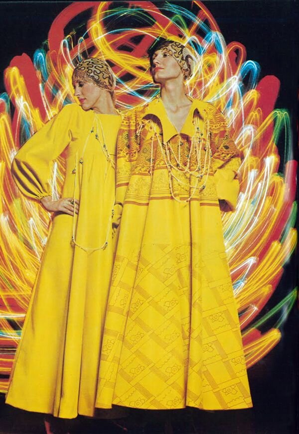
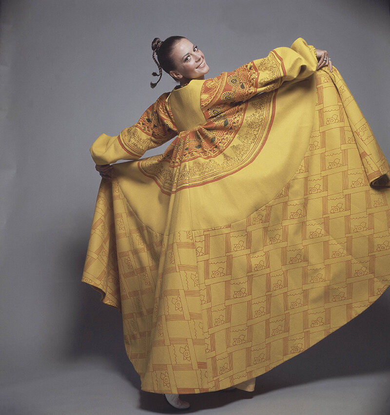
Above: Zandra Rhodes 1969 collection
In 1969, Zhandra Rhodes silk screened her daisy print on to bright yellow fabric. Rhodes moved to New York on the advice of fashion photographer David Bailey, who felt her designs would go down a storm in the American market. Indeed, Diana Vreeland who was at Vogue at the time fell in love with the effervescent collection and convinced Henri Bendel (one of New York City’s most prestigious department stores) to purchase the entire collection. Suddenly New York high society received a bohemian chic makeover!
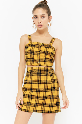
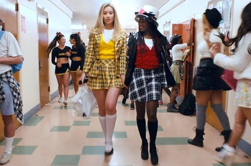
Cher Horowitz’ yellow check suit in Clueless (1995)
Anna Sui’s first runway show in 1991 translated the coordinating, acid bright suits of the 1960s for modern wear. Naomi Campbell pictured here on the left in a sunshine yellow suit was the precursor to cult classic Cher Horowitz’s yellow checked suit in the teen movie Clueless. Costume designer Mona May explained her choice as taking the classic uniform and twisting it. What would Cher do with a Catholic school girl uniform? Take it to another level: make it a Dolce & Gabbana yellow suit with over-the-knee stockings and matching Mary Janes and the furry backpack. The yellow was a stark contrast against the grungy trend of the time, where deep maroon, khakis and marl greys were omnipresent in the school style landscape.
It is a rare example of an ensemble that has been countlessly reinterpreted in all arenas - from fast fashion to the catwalk, to pop culture like music videos and Halloween costumes. This on-screen outfit is one of the most unmistakable fashion moments of recent times, and its combination of a classic tartan pattern, in a preppy two-piece reminiscent of suburban American high school culture, blended with a bright acid yellow has become a (somewhat tongue in cheek) symbol of female power and rebellion.
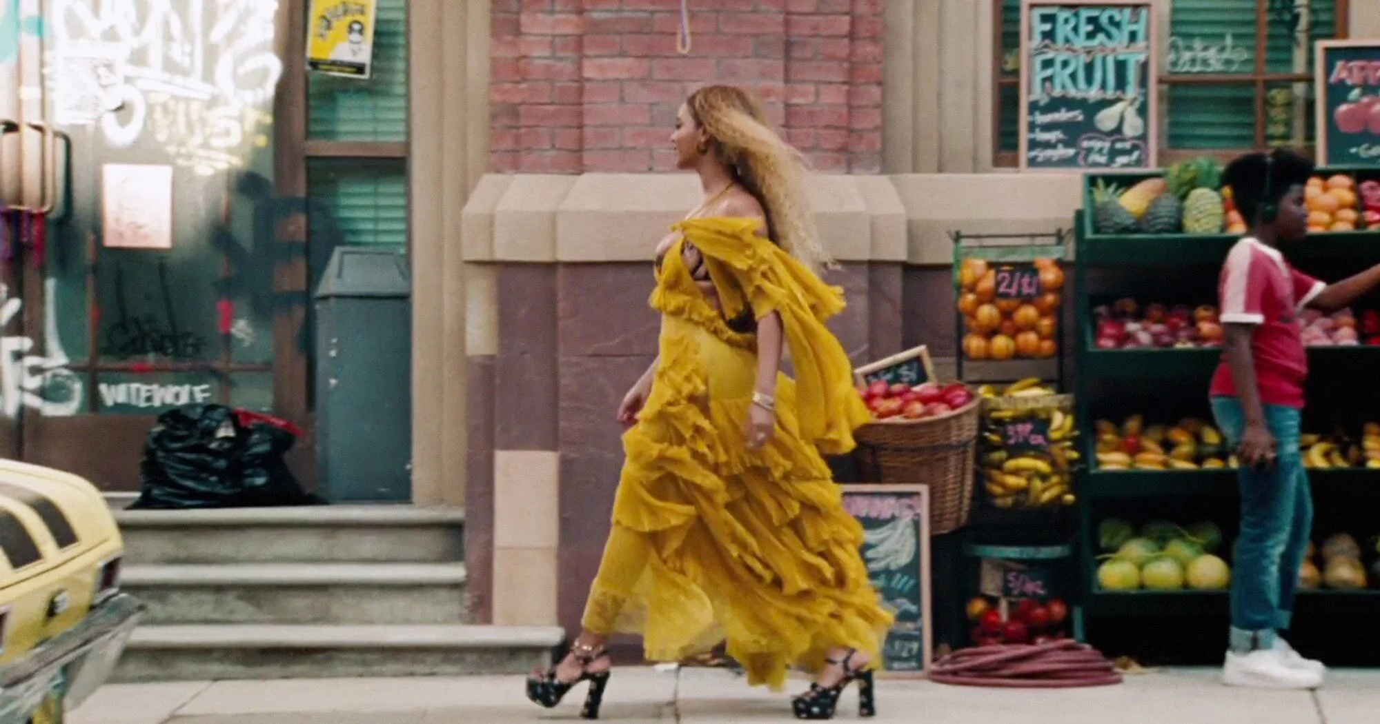
And while we are on the topic of iconic yellows - we have to mention the golden liquid luxury that is Chanel N 5. And Beyonce’s ‘Lemonade’ coloured dress that spawned a thousand ‘lookalike’ tutorials
Beyonce, Lemonade Video, 2016
In fact, yellow is having a bit of a renaissance as a colour - with the term ‘gen z yellow’ garnering increasing media attention. Generation Z yellow is an optimistic, bold shade that is meant to represent the brave and transgressive nature of the younger generation who are unafraid of drawing attention to themselves or to the social issues they are passionate about.
BLUE
Blue is often diametrically opposed to the vivid yellow we’ve just looked at in terms of atmosphere. Calm, airy and composed, blue is the colour of the sky and the sea and is considered to be the most commonly occurring colour in fashion (mainly due to the omnipresence of the denim fabric.)
In the Devil Wears Prada, Miranda Priestly sizes up Andreas awkwardly fitting slouchy blue jumper and explains that it isn’t just blue, but cerulean, first popularised by Parisian designer Oscar de la Renta in 2002. “Its sort of comical how you think you’ve made a choice that exempts you from the fashion industry, when in fact, you're wearing a sweater that was selected for you by the people in this room,” she says, alluding to the complex fashion system that dictates the colour that ends up on shop rails. Cerulean is actually the ‘official colour for the Millenium’ as selected by global colour consultancy firm Pantone. “Psychologically, gazing at a blue sky brings a sense of peace and tranquillity to the human spirit,”.
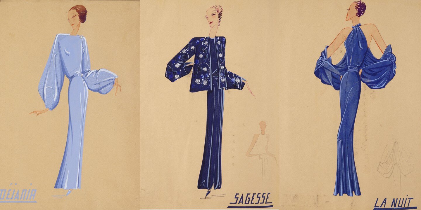
Fashion illustrations by Jeanne Lanvin, ca. 1920s
Jeanne Lanvin is just one of a few designers who had a strong signature blue colour, evident in her early sketches from the 1920s. Originally a milliner, she began designing clothes in 1909 inspired by her lifelong muse, her daughter. On travels to Florence, she was taken aback by a particular shade of blue in a Fra Angelico painting, and upon her return to Paris, set up a dye workshop to produce it so she could use it in her collections.
The shade appeared in her earliest clothing collections and has remained a staple, even to this day. And finally, another instantly recognisable blue in a duck-egg, greenish tone. The Tiffany & Co. branding has come to represent timeless romance and simplistic elegance the world over.
The Complexity of Colour in Fashion
Collage by Sue Rogers
So how to conclude?
Although colour forecasting can guide us - they take into account the lead time needed for manufacturers to secure raw materials to produce dyes and negotiate contracts with suppliers, the relentless shifts in consumer tastes make colour hard to pin down. Perhaps it is the personal preference we all have for certain shades, along with the myriad and constantly evolving meanings of each tone, that make colour so fascinating in the first place.
Perhaps we shouldn’t be looking to rationalise or justify our fashion colour choices, and indulge instead in the gloriously ambiguous rainbow available to us unapologetically.

