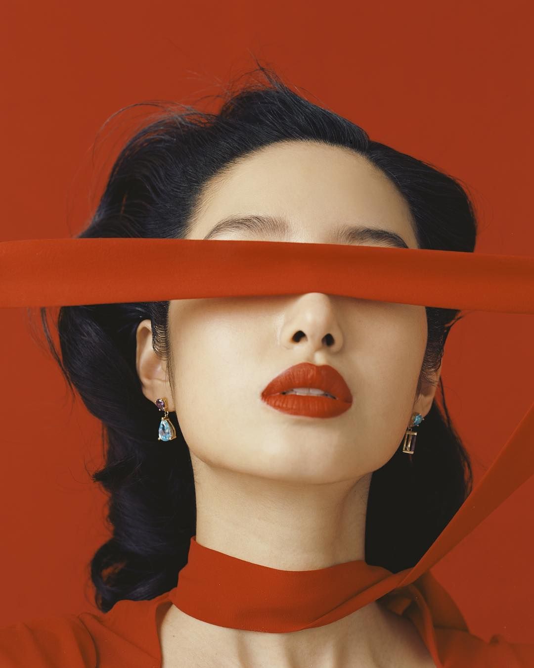
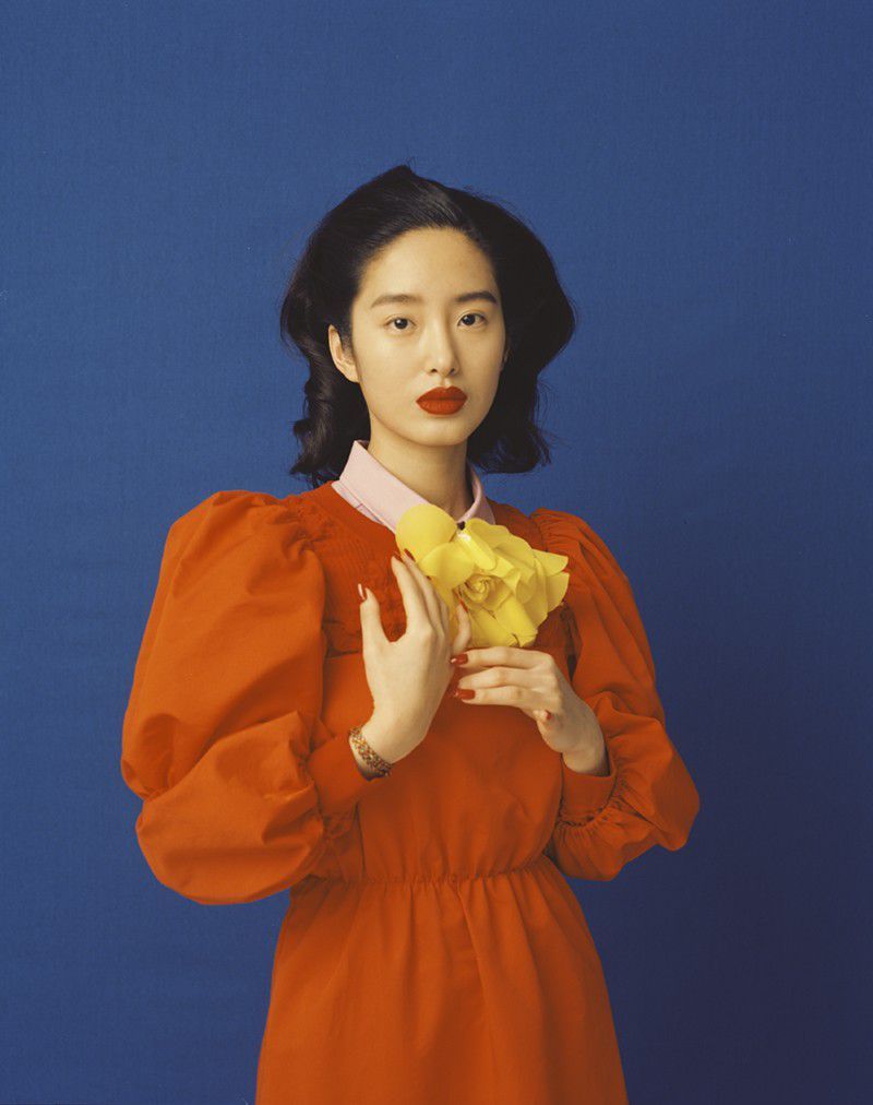
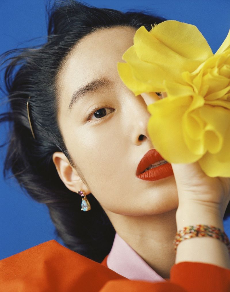
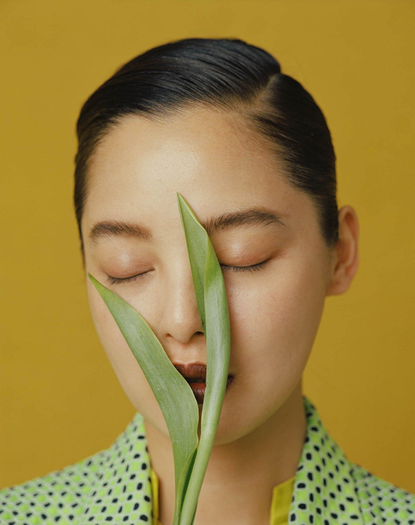
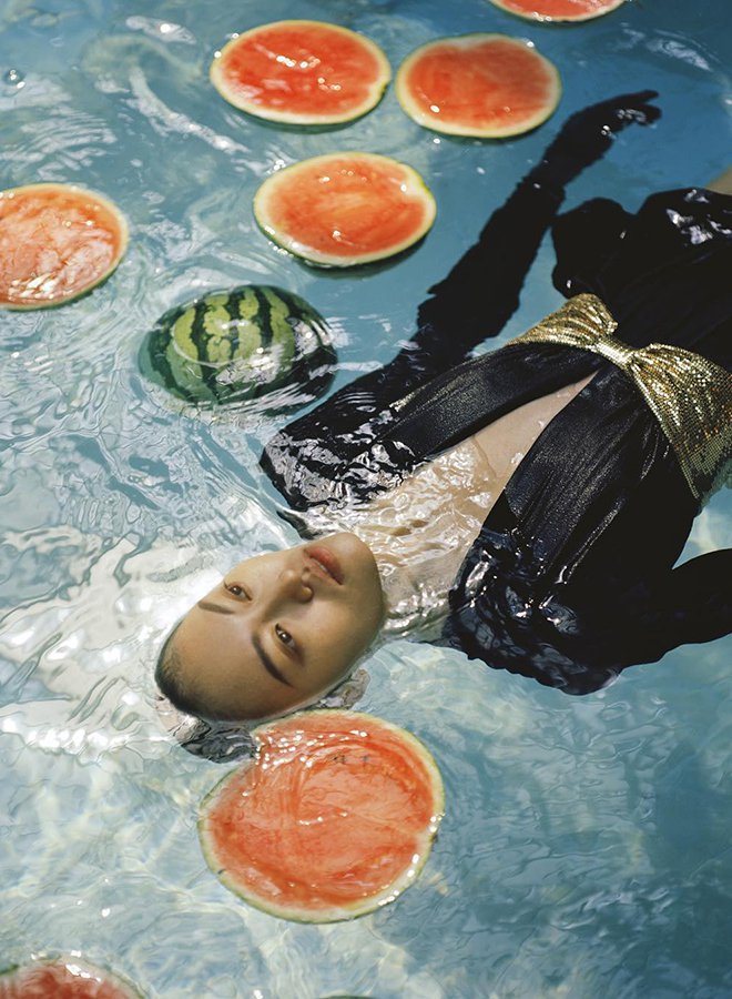
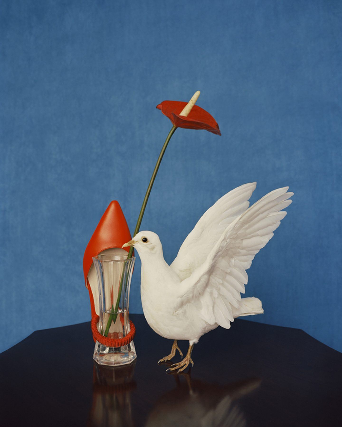
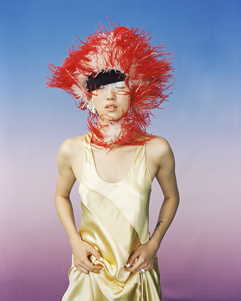
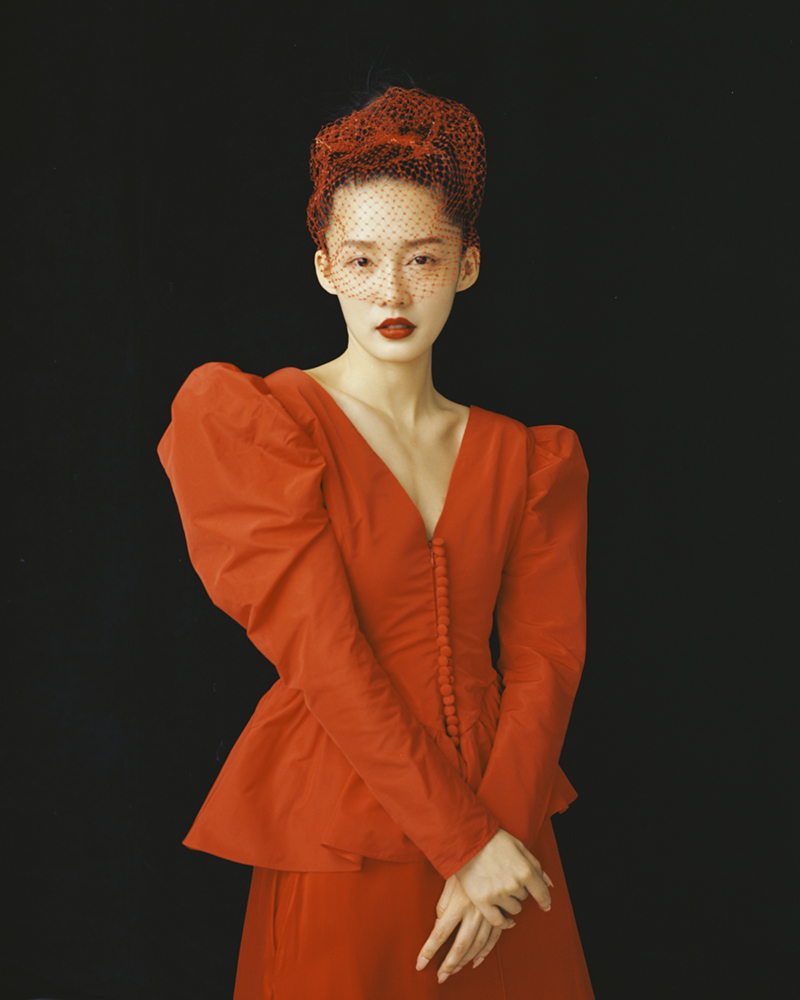
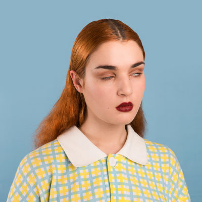
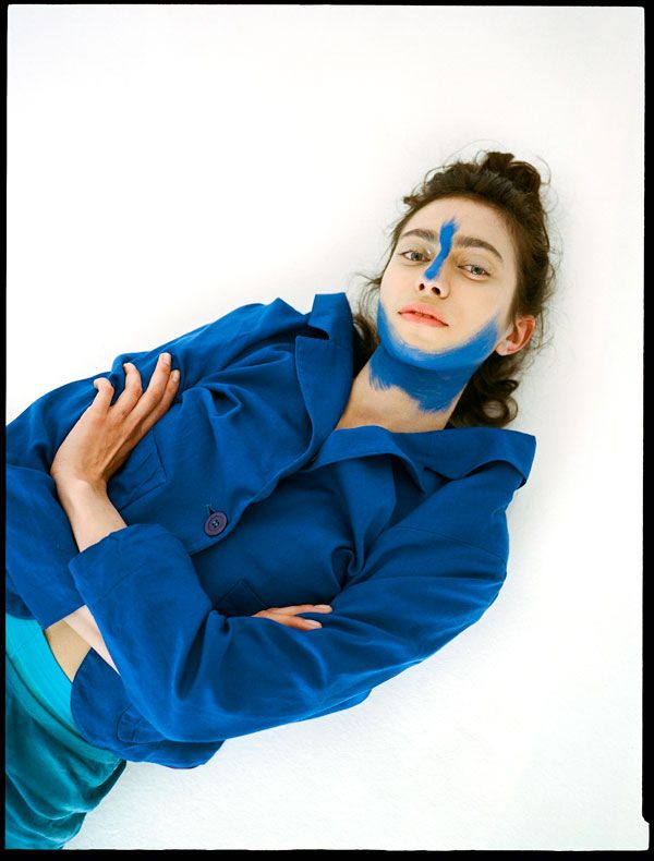
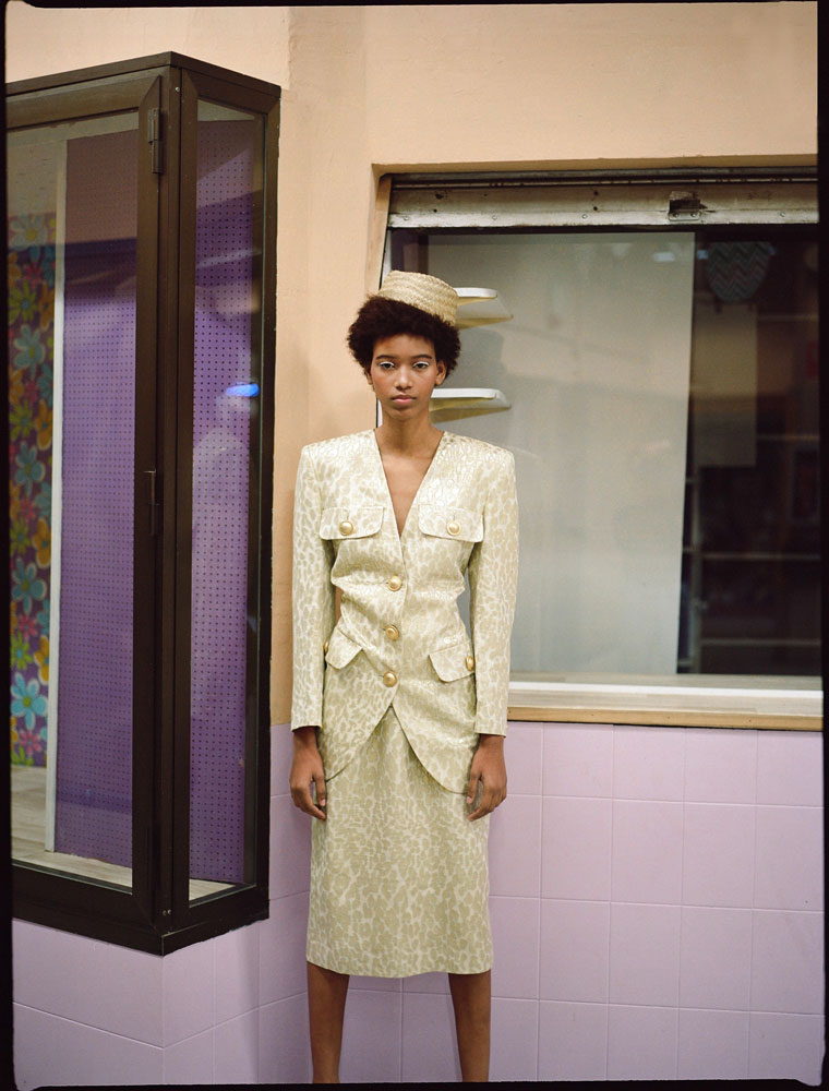
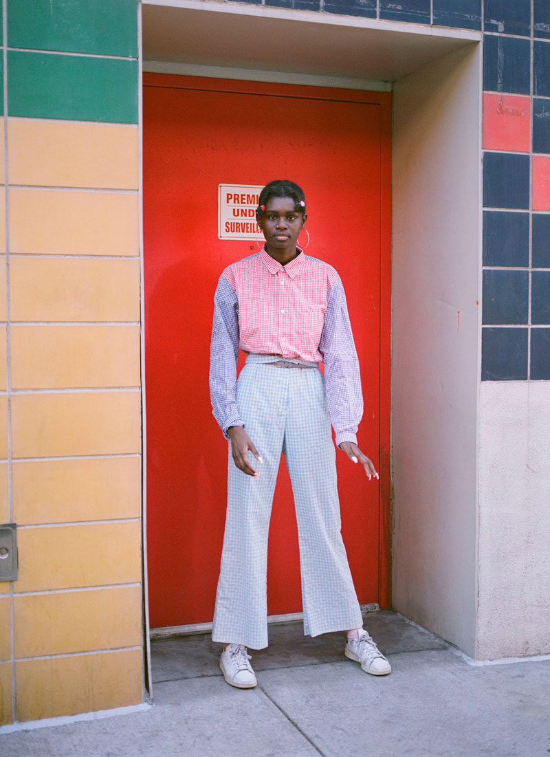
When you think about the media you go to for fashion inspiration (glossy magazines, fashion blogs, Instagram feeds) you probably picture a stream of vibrant images that catch the eye and inspire you in some way. Most of these images are probably colourful, or at the very least, coloured.
As consumers, we gravitate towards colour imagery, particularly in fashion, because it gives us a more accurate representation of the garment itself. If you can’t touch it, you can hunt down the runway photographs and imagine closely what it might be like in the flesh.
Colour gives dimension, it informs texture, it can either turn us on to a piece, or turn us off completely. And yet, when you google ‘iconic fashion photograph’ this is what you get...
One lonely colour image in a sea of black and whites!
Ted Grant, commonly regarded as the father of Canadian photojournalism, once said: “When you photograph people in colour you photograph their clothes. But when you photograph people in black and white, you photograph their souls!"
His inference is that colour imagery distracts from the true substance of an image. It trivialises colour as a frivolity, as decoration… as an afterthought. But I would argue that colour photography, particularly within the realm of fashion, has no less artistic merit than its monochromatic counterpart.
Colour, when used in a conscious way, can be as striking and emotive as a black and white image. But as in all big developments in the arts, the transition from a black and white world of imagery to a technicolour one never did run smooth...
William Eggleston. Untitled. 1976
William Eggleston’s watershed exhibition of colour photography at MOMA in 1976 was described as “perfectly boring” by Hilton Kramer and slammed by a host of other art critics. What Hilton didn’t know was that this show would mark the turning point in the perception of colour photography. Alongside Eggleston in the late 1960s and 1970s, a group of photographers explored the use of colour film photography and questioned the conventions of the time by creating raw portraits of modern suburbia and subtle critiques of the “American Dream.” This group of artists came to be known as the New American Colour Photographers.
The Democratic Forest, William Eggleston
The colour of the New American Colour photographers was not just a happy byproduct of the newly available photographic technology, it was also central to the message. The colours captured the corporate logos that became instantly recognisable in modern materialistic american society. They showed bright blue skies in all their glory and the storybook white picket fences that came to epitomise the american aspiration to middle class suburbia.
William Eggleston. Untitled. 1976
But the colour served a dual purpose. As well as portraying the glorious moments of middle america, it captured the underbelly. The rusting cars and tarpaulins, the faded signage, the almost alien glow of neon lamps, the griminess around the edges that hints at ‘everything not being quite as it seems.’ Up until this point, colour photography was used primarily in commercial advertising imagery - photography with ‘artistic merit’ was, almost without exception, black and white.
William Eggleston, Untitled. 1970
Shooting in colour, as a photographer who defined themselves as a fine artist, was therefore a challenge to the traditional dichotomies of photography (colour = lowbrow / black and white = highbrow). But Eggleston persevered with his preferences - he would continue to shoot in colour, and that was that.
William Eggleston. Untitled. 1976
The new american photographers not only normalised colour photography for the ‘fine art’ image, they made colour an intrinsic part of their composition and approach. They paved the way for contemporary photographers to embrace colour as an integral part of their created process and helped to break the stigma around colour photography, but also that genres had to be homologous to be considered valid. Instead, photographic work could straddle the worlds of portrait, documentary, fashion and fine art and be no less valid for it.
Marie Cosindas
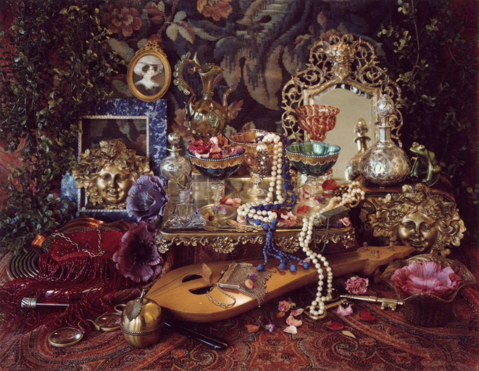
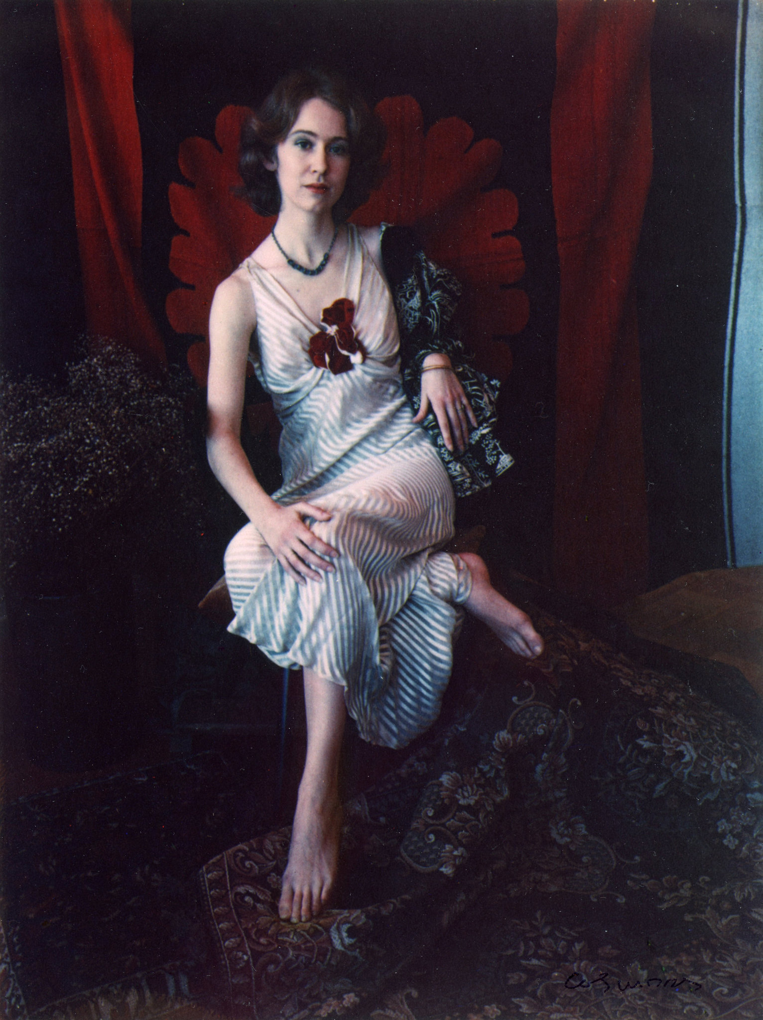
Marie Cosindas is one of the New American Colour photographers that history has more or less forgotten. After an encouter with Ansel Adams (who is nothing if well-versed in black and white photography) in which he told her she was taking black and white photographs but ‘thinking in colour’, Cosindas decided to try her hand at colour photography. In 1962, she was commissioned by Polaroid to test their new colour film.
Marie Cosindas Lenore, Boston. 1965
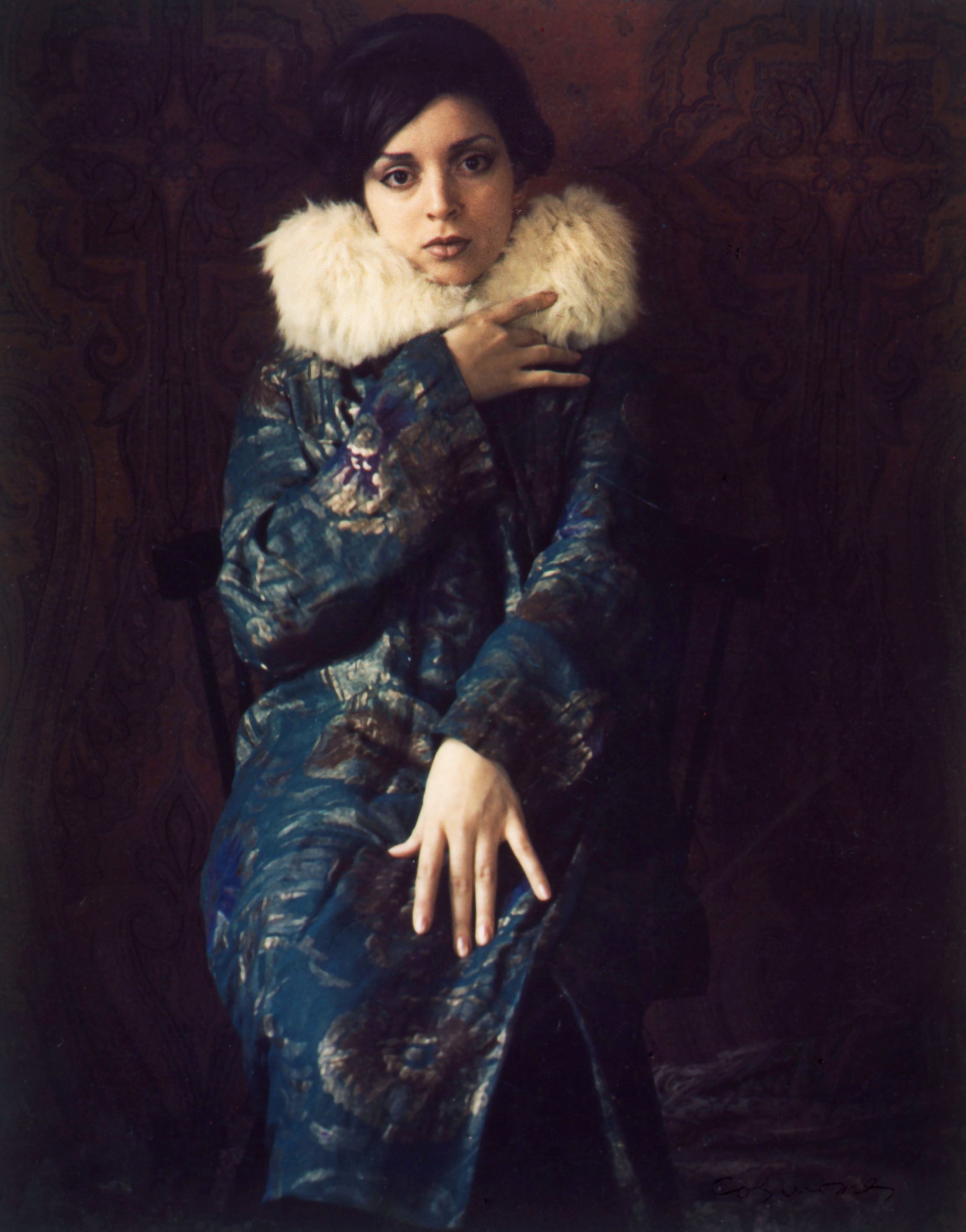
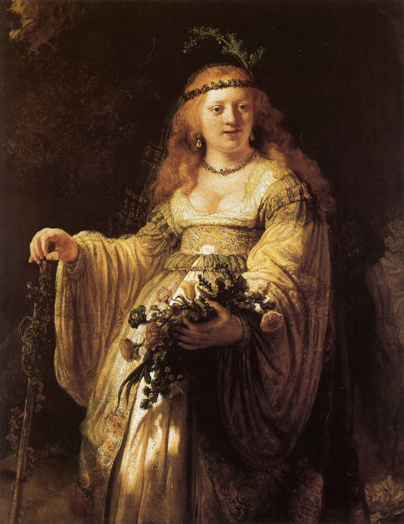
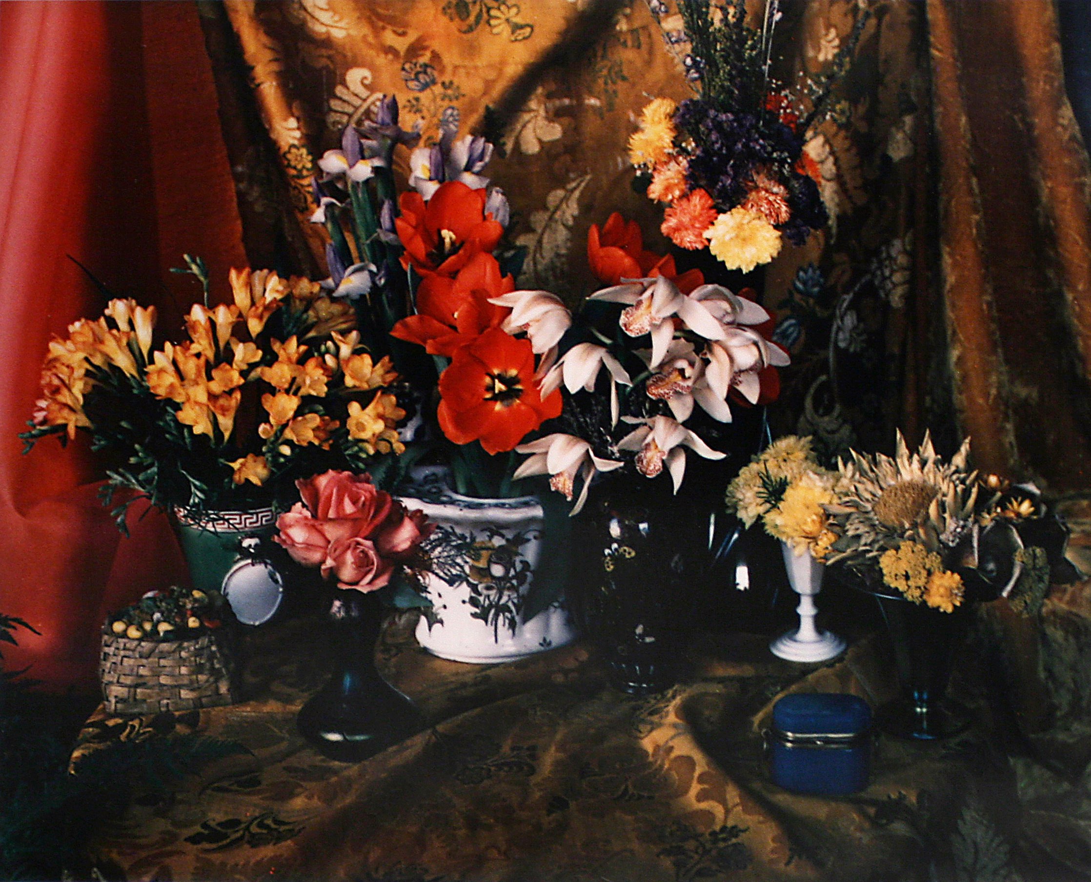
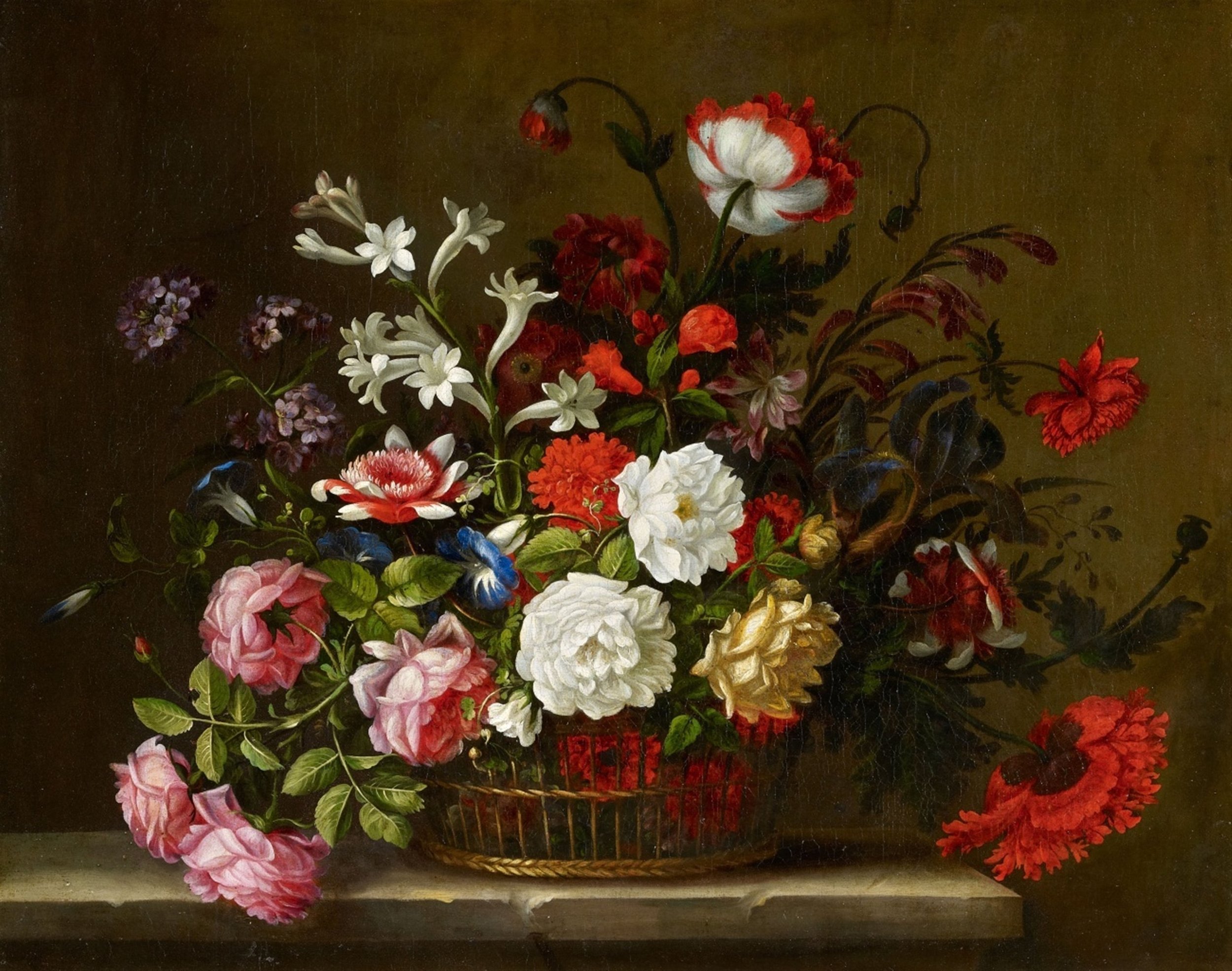
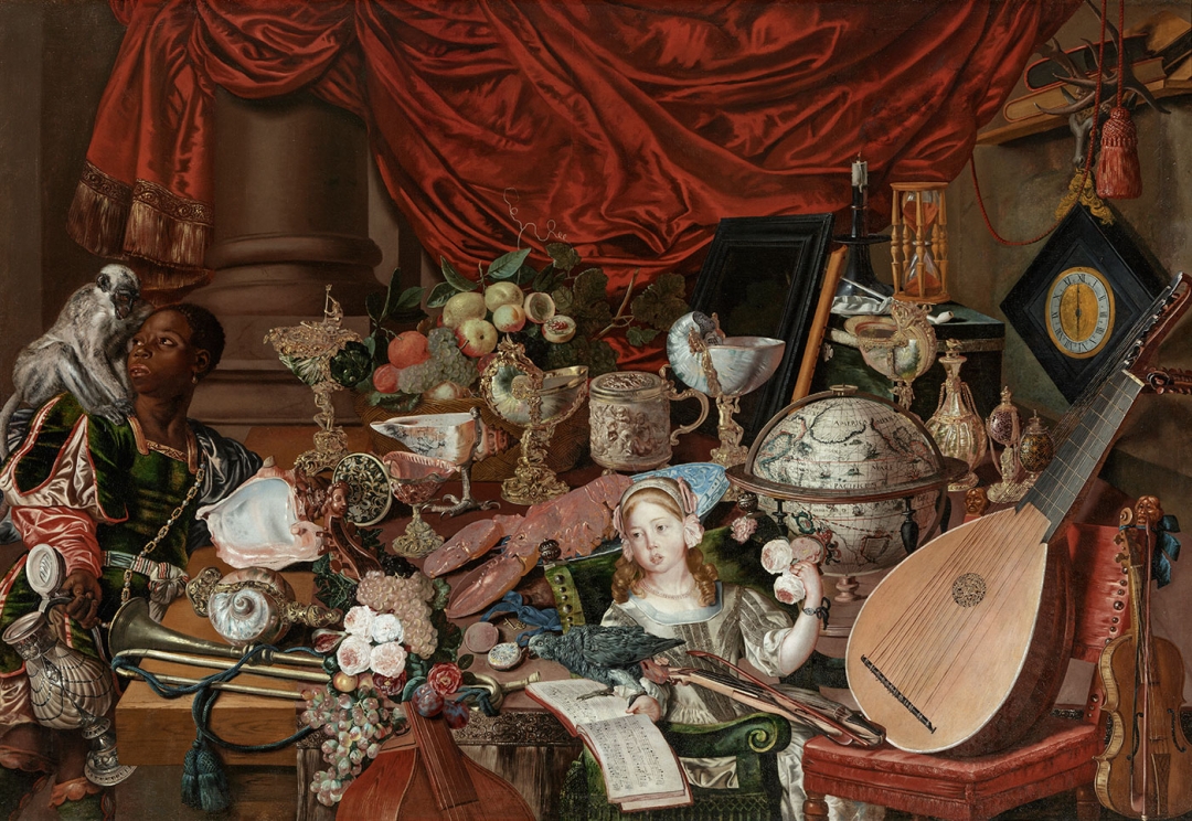
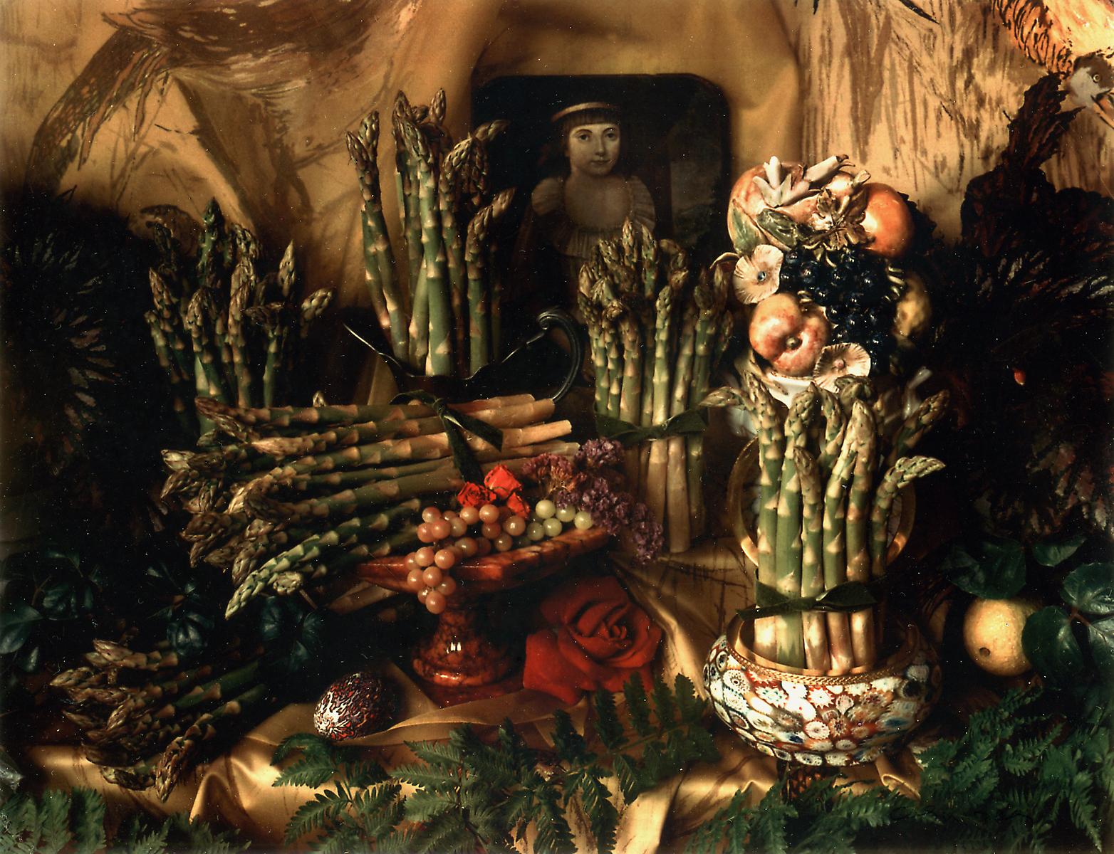
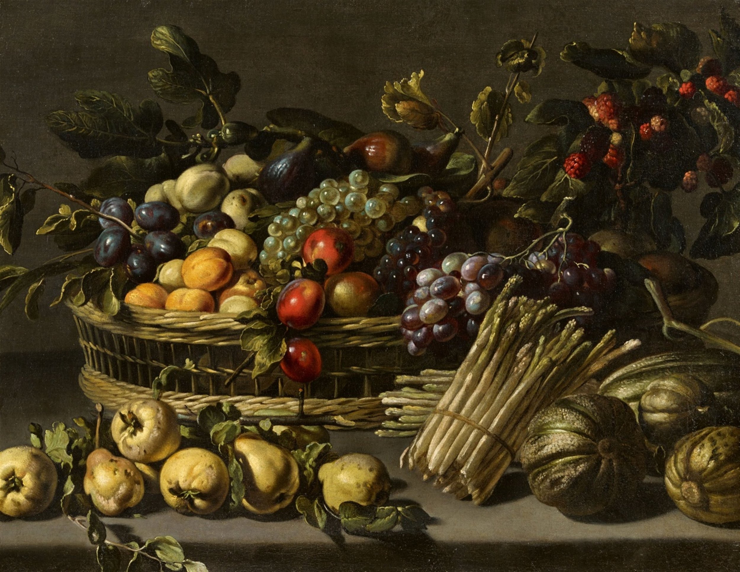
After a period of experimentation - in which she admits she did ‘everything they told me not to do’ she began to create her signature photographic style. “[The film produced] results that were like no other colour I had ever used,” she recalled. They even caught the eye of a curator at MOMA who remarked on their similarity to classical paintings. And this was no coincidence, Cosindas purposefully constructed her images as though they were paintings - from seated portraits to her styled still lives, relying on natural light and the careful arrangement of ‘objets.’
From start to end: [1] Marie Cosindas, Ellen, 1965. [2] Rembrandt, Saskia Dressed as Flora, 1634. [3] Marie Cosindas, Untitled, 1963. [4] Artist unknown, Still Life with Peonies, Poppies, and other Flowers in a Basket, 17th century [5] Marie Cosindas, Secret of Sense, 1984 [6] Unknown artist (Dutch School), The Paston Treasure, 1663 [7] Marie Cosindas, Asparagus IV, 1967 [8] Adriaen van Utrecht, attributed to, Still Life with Fruit in a Basket surrounded by Melons, Quinces, and Asparagus, 17th century.
You can see the similarities clearly in the images above. Note how the fabric is illuminated in areas where it catches the natural light, the face is in chiaroscuro, the backdrop is ambiguous and moody. Both images are incredibly atmospheric. Although they are in colour, the photographs remain dark. They invite the viewer to pore over the details, from the soft facial features to the folds and textures of fabric.
The slightly faded colours made them more palatable at the time to snobbish critics and editors who were used to seeing colour imagery used primarily for advertisements in bold, saturated tones. In this way they channel an antiquated elegance that is difficult to pin down to a specific place or time.
She stated “The world in black and white did not totally satisfy me, and color seemed the way to add more feeling and mood to what I was already doing.”
Ironically, it was Marie’s unique way of working with film that ultimately harmed her career. Because her body of work was mainly composed of one-off Polaroid prints were impossible to safely reproduce, their mileage as moneymakers was limited.
Marie Cosindas, Andy Warhol
For many galleries, this was a dealbreaker of sorts. Without the ability of galleries and art dealers to capitalise on her artistic output to the fullest extent, her popularity waned. She remains relatively unknown to this day, in spite of having photographed some of the iconic figures of the 20th century (Warhol, Yves Saint Laurent, Coco Chanel etc.)
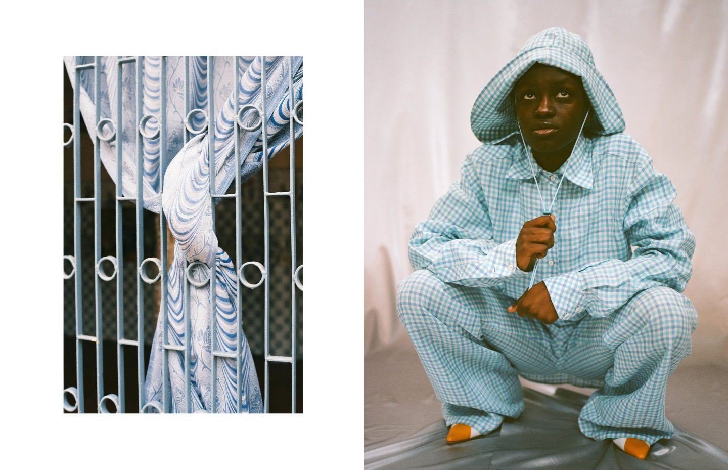
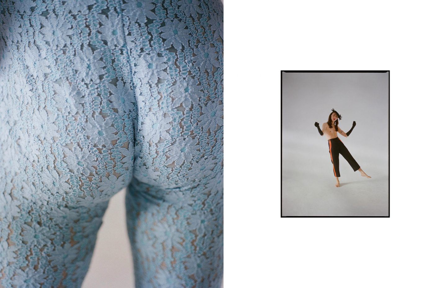
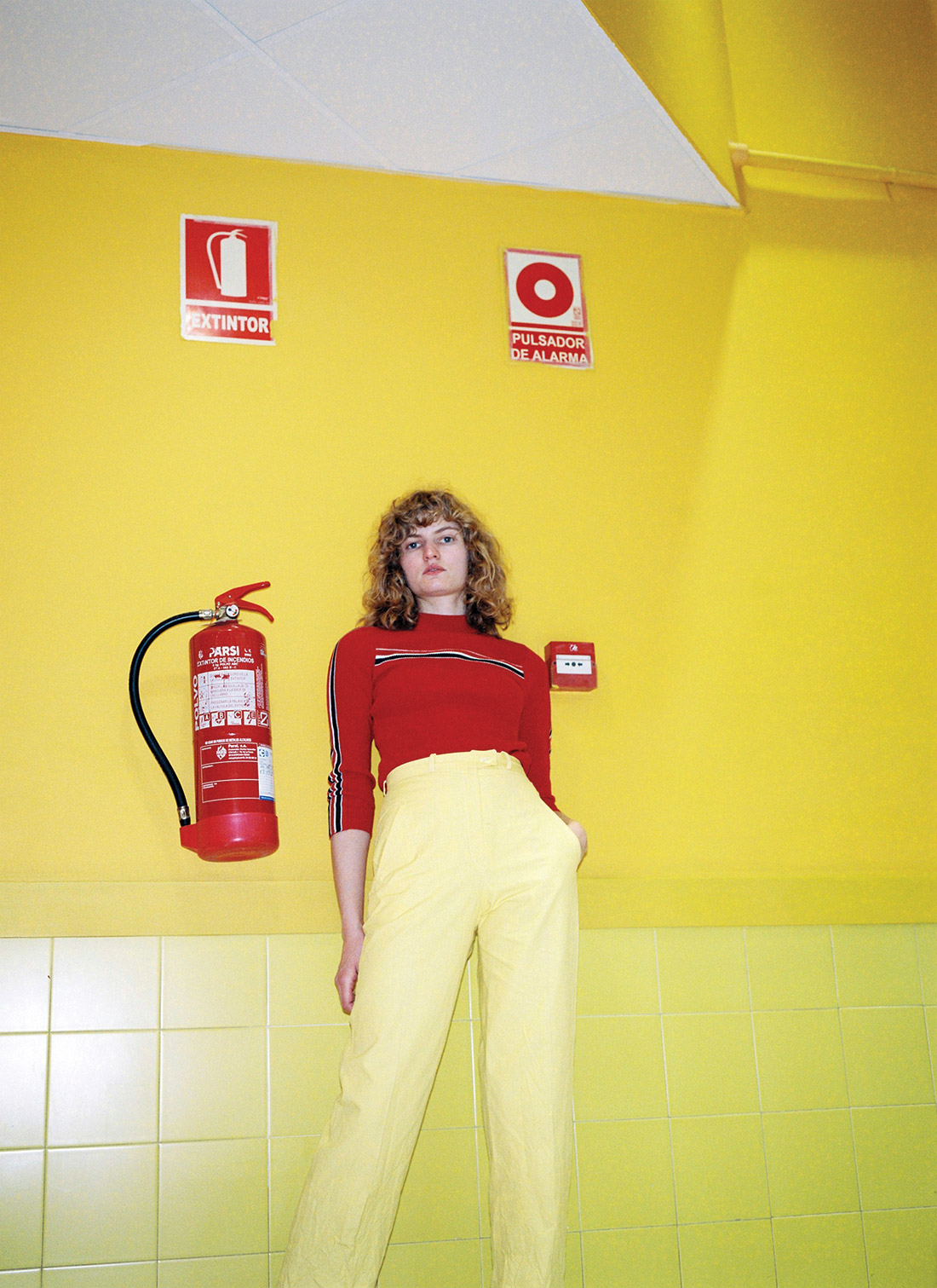
Moving into the 21st century, Olga De La Iglesia is a barcelona based photographer whose approach to colour embodies the spirit of the new american photographers. She uses it as a tool to enrich her fashion imagery and elevate it into a more cerebral, conceptual realm.
She uses colour as a tool to reveal the joy and beauty of ‘random truths’ in everyday life - combining styled fashion elements with snapshots of found scenes. As a result, her approach to colour is at once playful and artistic.
She uses coloured forms to create visual echoes between still lives and fashion portraits. Here, a pack of garlic bulbs packed in purple plastic mesh sits alongside a model holding a length of satin-like purple fabric. The textures differ but the colour unifies them into an image we can understand and appreciate as a whole.
The often humorous split screens between person and object can feel silly: two images mashed together in a not altogether coherent way, but the clear consideration of form and hue remind us that this is a fashion image with substance. Olga’s refusal to label herself as a photographer is indicative of her genre-fluid work.
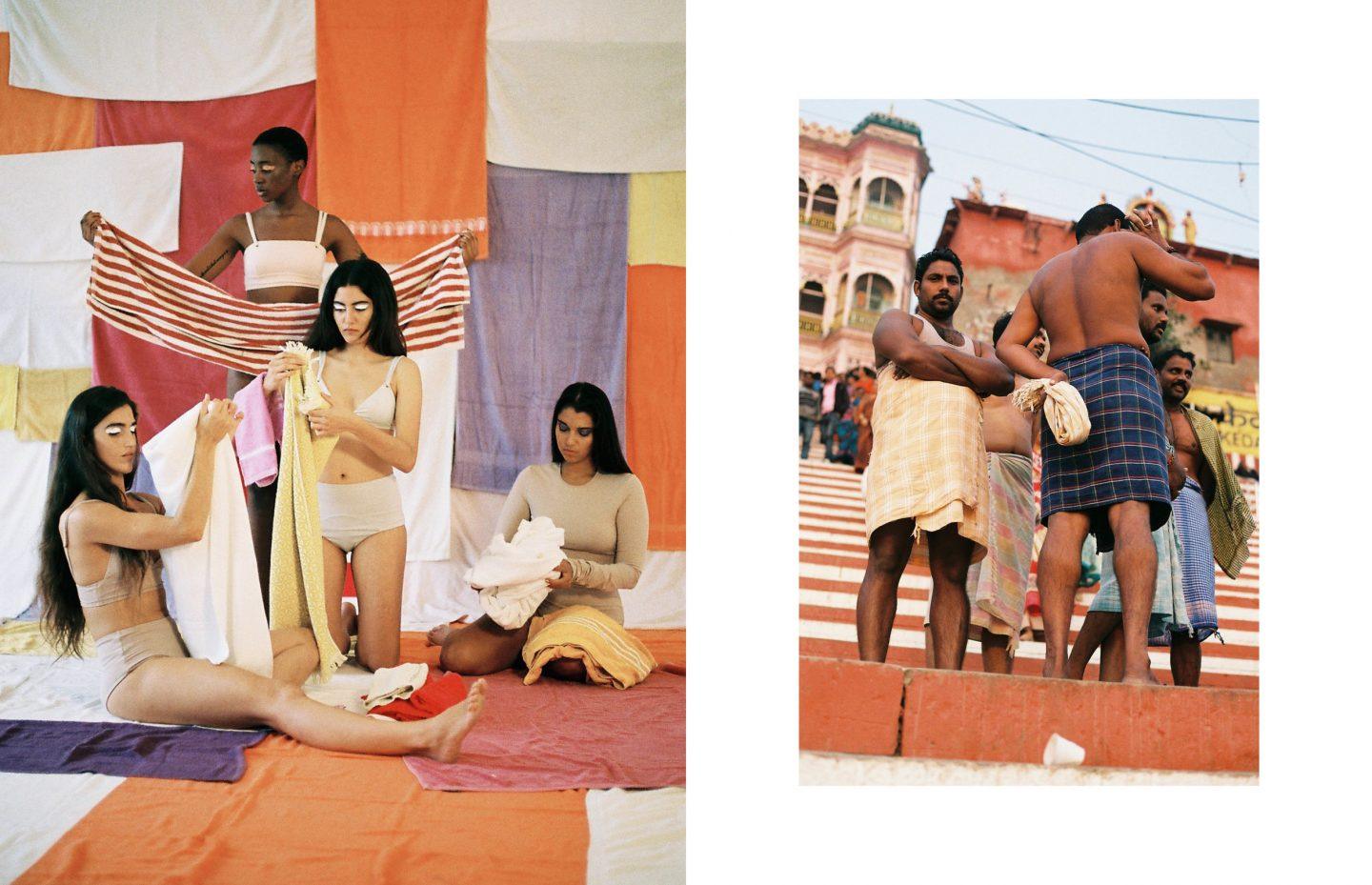
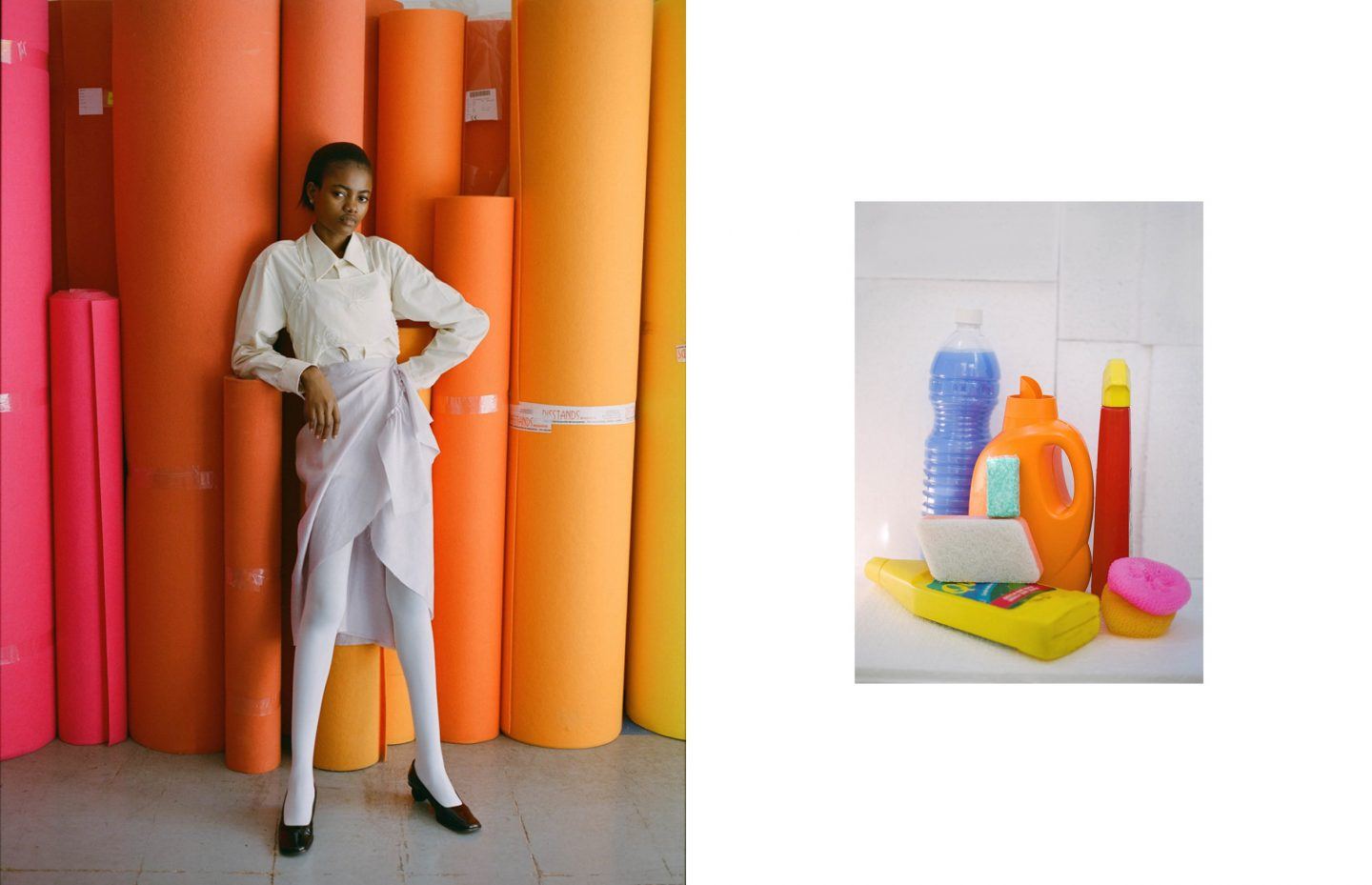
Her fashion work is often presented next to strangely mundane still lives against brightly coloured backgrounds, arrangements of everyday objects that look like they were stumbled upon. Either that, or the exact opposite is true: where the second half of the diptych is a carefully considered arrangement of objects that has been visible manipulated by the photographer to echo the other image.
Here, she uses a colour palette to marry two images together. Before we see the echoes in the subject matter - on the left, women fold towels in their underwear, suggesting they have just bathed. On the right, some men wrapped in towels stand around chatting - we see the coherence in colour that tells us that these images are linked.
Understanding colour as a culturally contextual entity, she explains “In every culture, colour stands for a diverse feeling, meaning, emotion, pride, memory and habit. Still, they physically are the same to our eyes. The only thing that changes is the visual code we use to understand them.”
Olga’s work combined staged fashion image with ‘found’ elements - a small packaged soap bar, something stumbled upon. The accidental nature of her still lives capture her obsession with the everyday, the mundane and the manmade. By pairing these moments with often slightly surreal fashion editorial work, they are transformed into something far more meaningful.
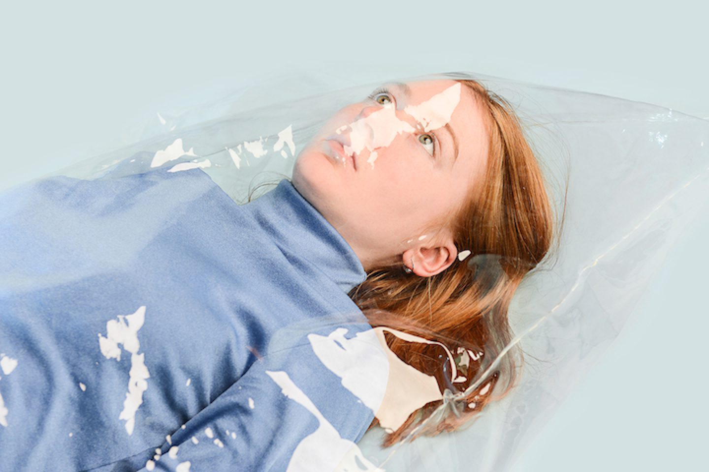
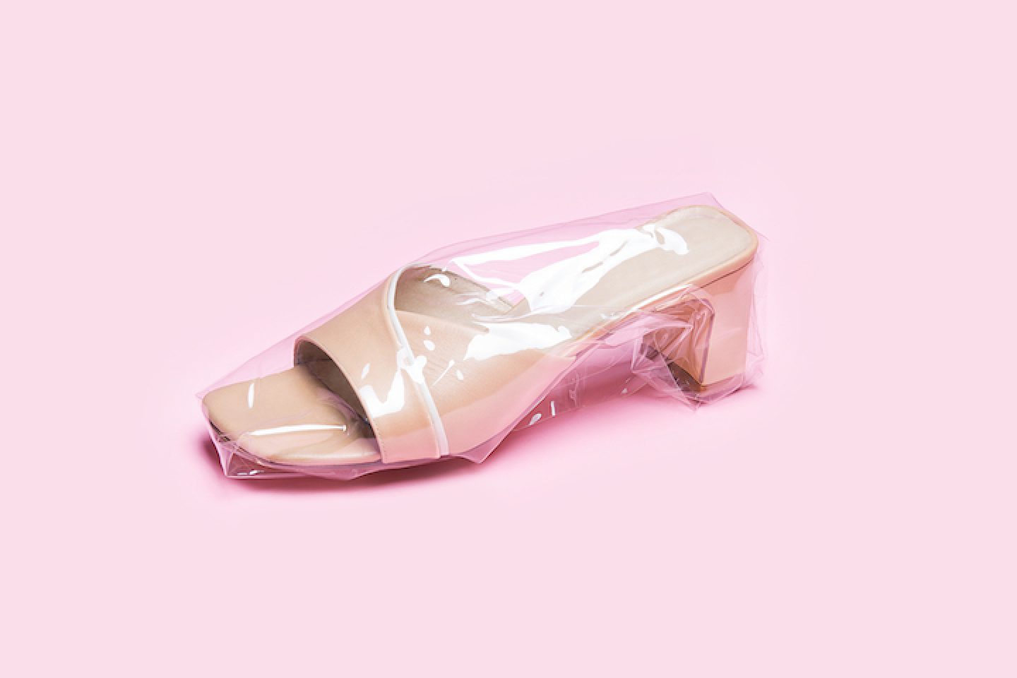
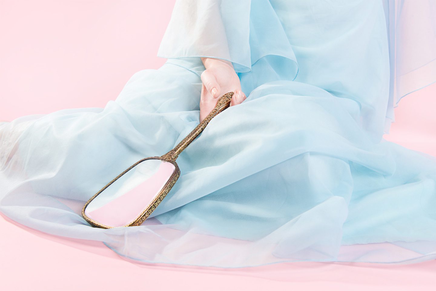
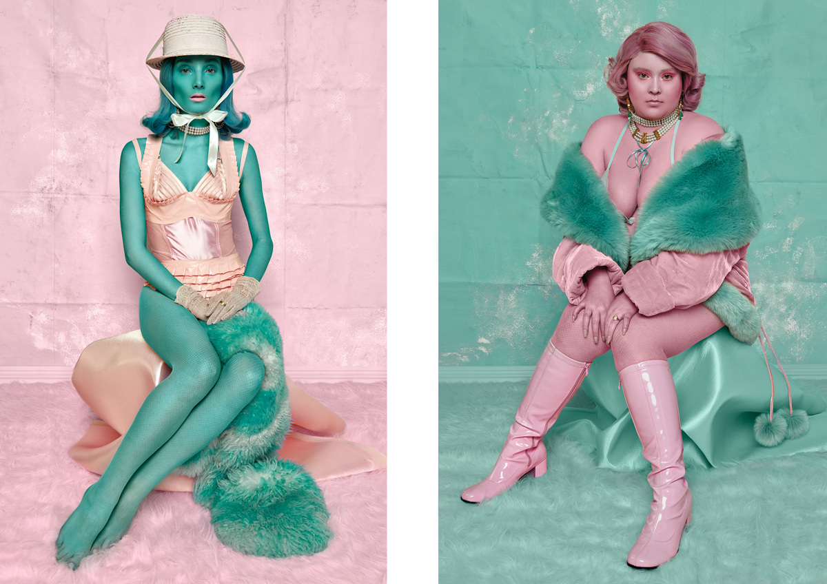
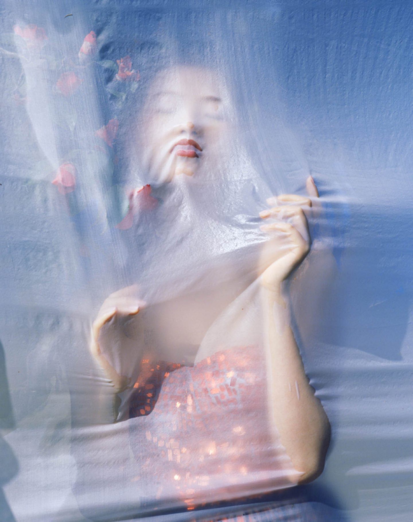
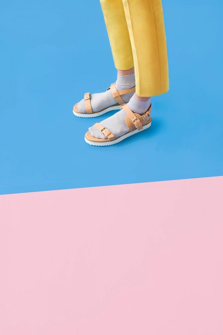
Phebe Schmidt, on the other hand, uses a very restricted colour palette in much of her work. In this series, for example, she sticks to pastel tones - baby blue, ‘milennial pink’, slick nudes and milky whites. The candy coloured tones are almost sickly when combined together, reminding us of sugary childhood snacks like candyfloss and marshmallows. The images are at once soft on the eye, and slightly unsettling in their saccharine tones.
Her pictures show a homogenized, generic beauty that verges on the unreal. Here, the monotone eggs and totally opaque white and blue vases are visual shortcuts for this. Schmidt’s comment on the staged nature of the fashion world and our standardized beauty ideals is to beware of what appears outwardly beautiful and perfected.
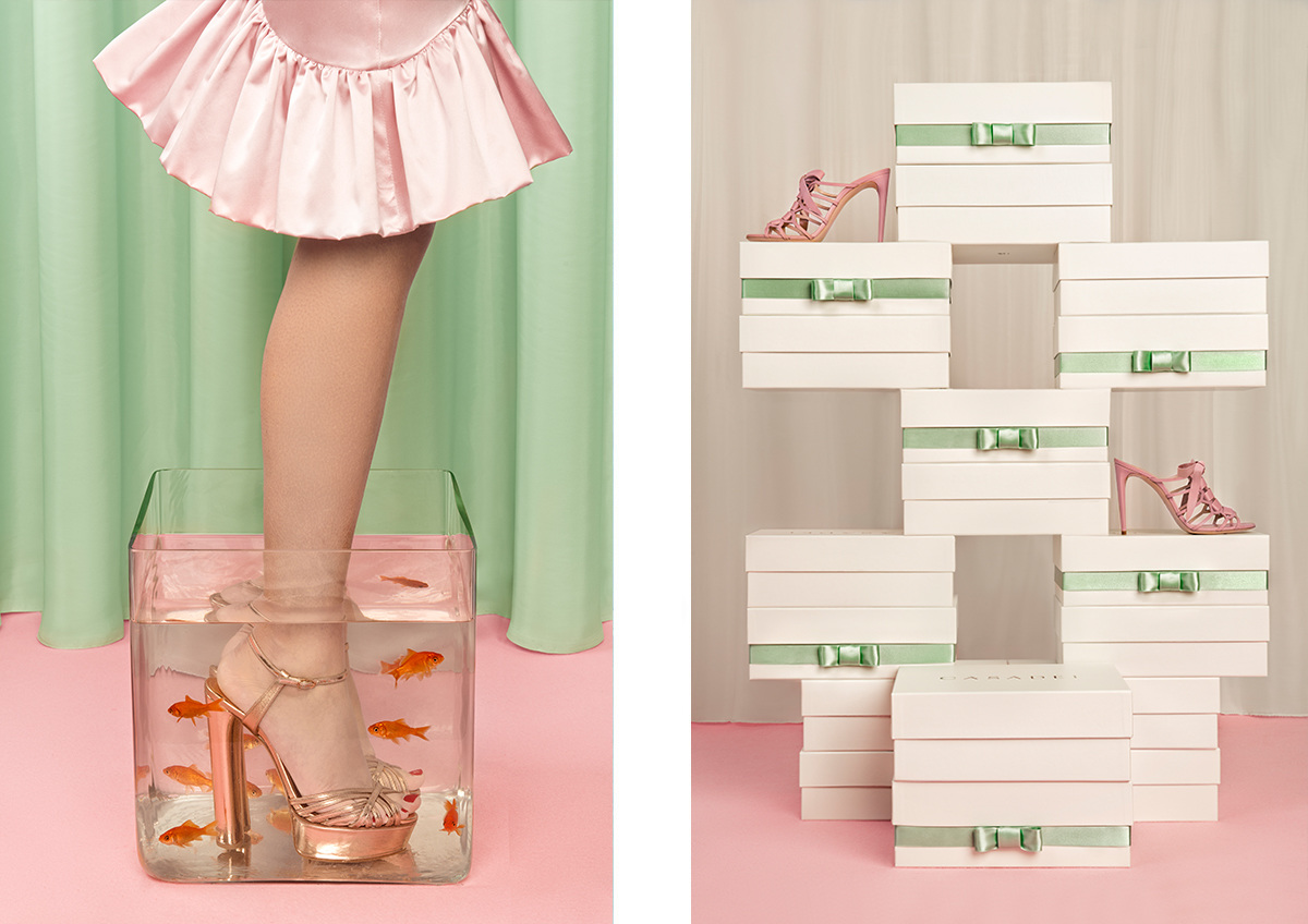
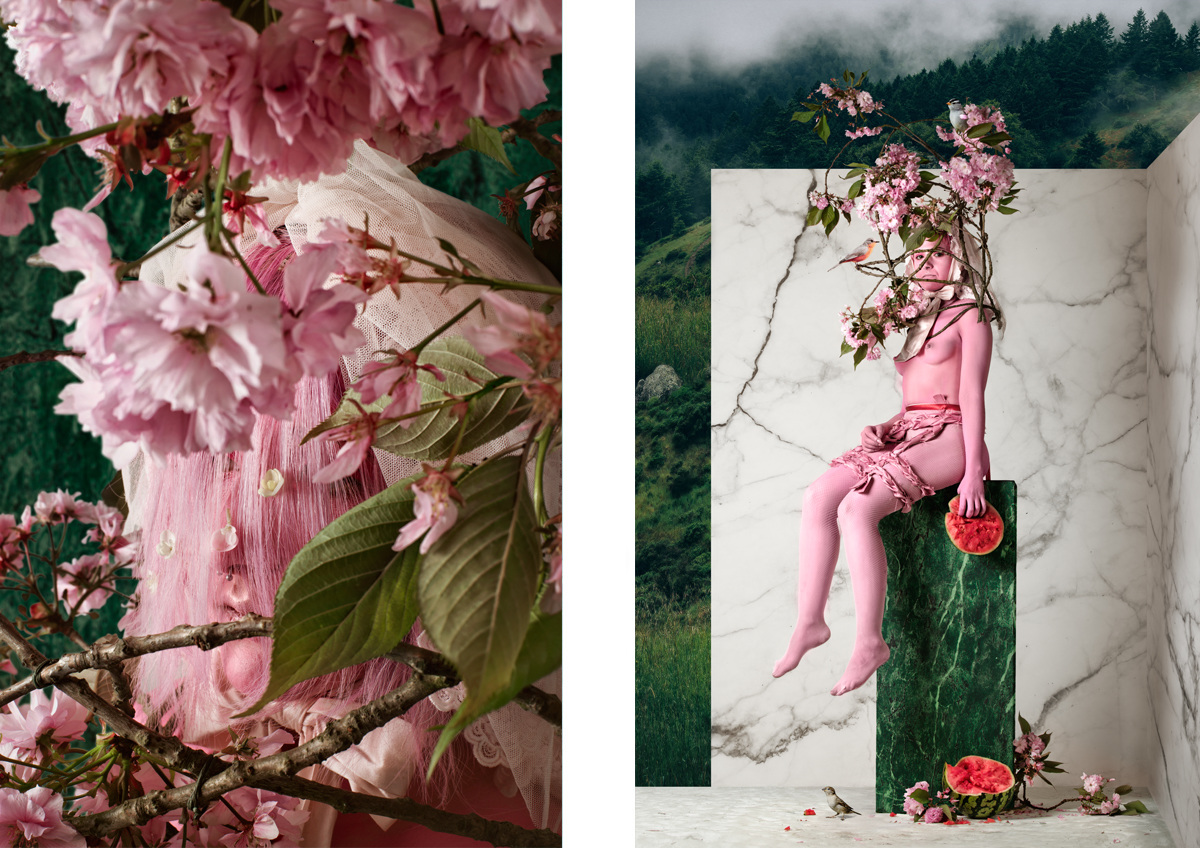
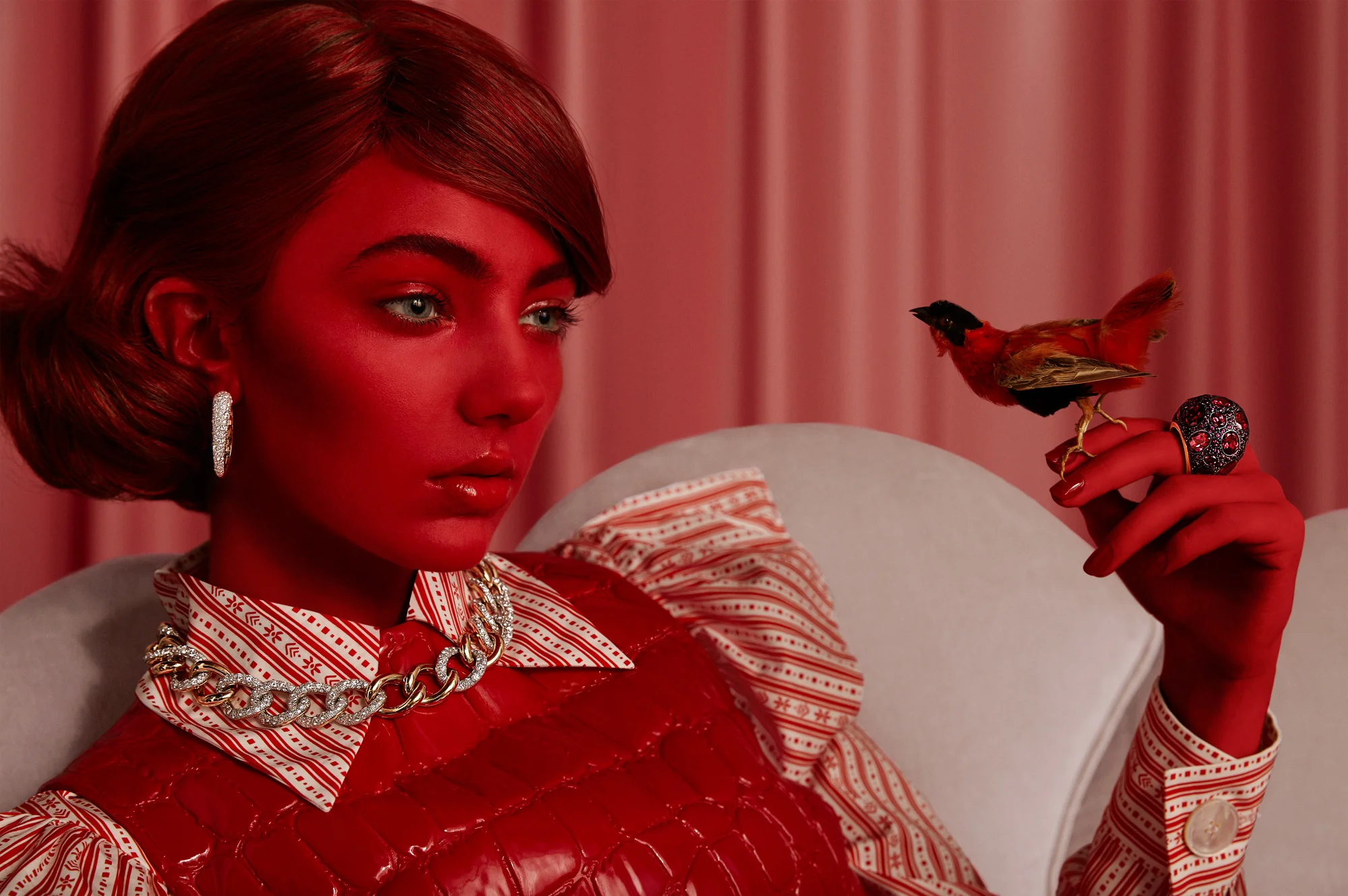
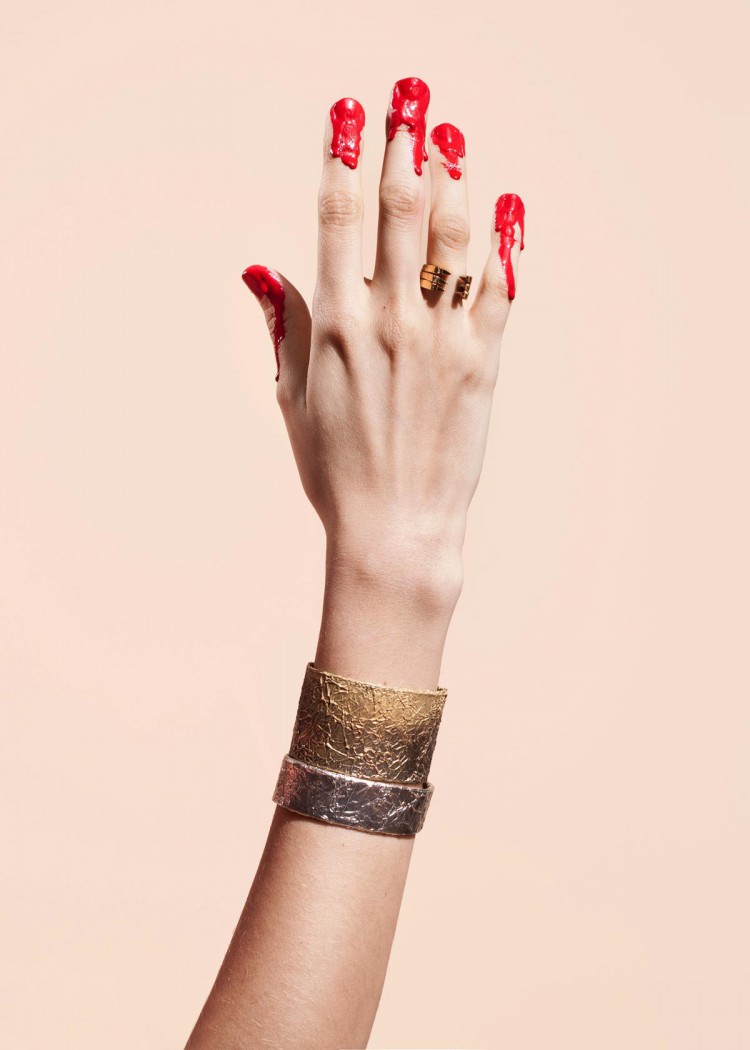
Carolina Mizrahi takes a more commercial approach to her fashion photography work. She spent a decade as the in-house photographer for a fashion brand in her native Brazil, and her work’s high production value look points to this. The studio lighting is perfected, with barely any shadows showing. Colours are consistent and standardized over the image that create a sense of perfection and harmony in which can feel disquieting or disturbing.
Her work explores theories related to the representation of women in media, gender stereotypes and beauty rituals in a way that still feels sophisticated enough to be used as brand or advertising imagery. A recurring motif she uses is the application of makeup and digital manipulation to alter the colour of her subjects skin - creating almost alien creatures (think Moschino MFW 18 with their otherworldly Jackie O’s).
Challenging one of the most basic expected visual cues - skin tone - clashes with our evolutionary instinct to perceive skin colour within a fixed colour range.
Using limited tones within these images furthers this challenge to the viewer: what is female beauty? What is perfection? The result is that we feel transported to another planet, or that we are looking at robots or dolls rather than human subjects.
Carolina says that she enjoys working with a controlled colour palette. She explains that “Most of the times colours are part of an elaborated choice of signs I combine and contrast with the visuals I create. “ Some of the recurring shades, like baby pink and blood red, point to some of the wider themes of her work, like femininity and the dark side of material excess.
The overly retouched and airbrushed look of her images feed into her ideas about the rigidity of grooming rituals, and the slow and steady intermingling of our physical bodies and digital ‘avatar-like’ online personas. As our real selves undergo surgery, procedures, modifications - the real and the hyperreal become increasingly difficult to distinguish.
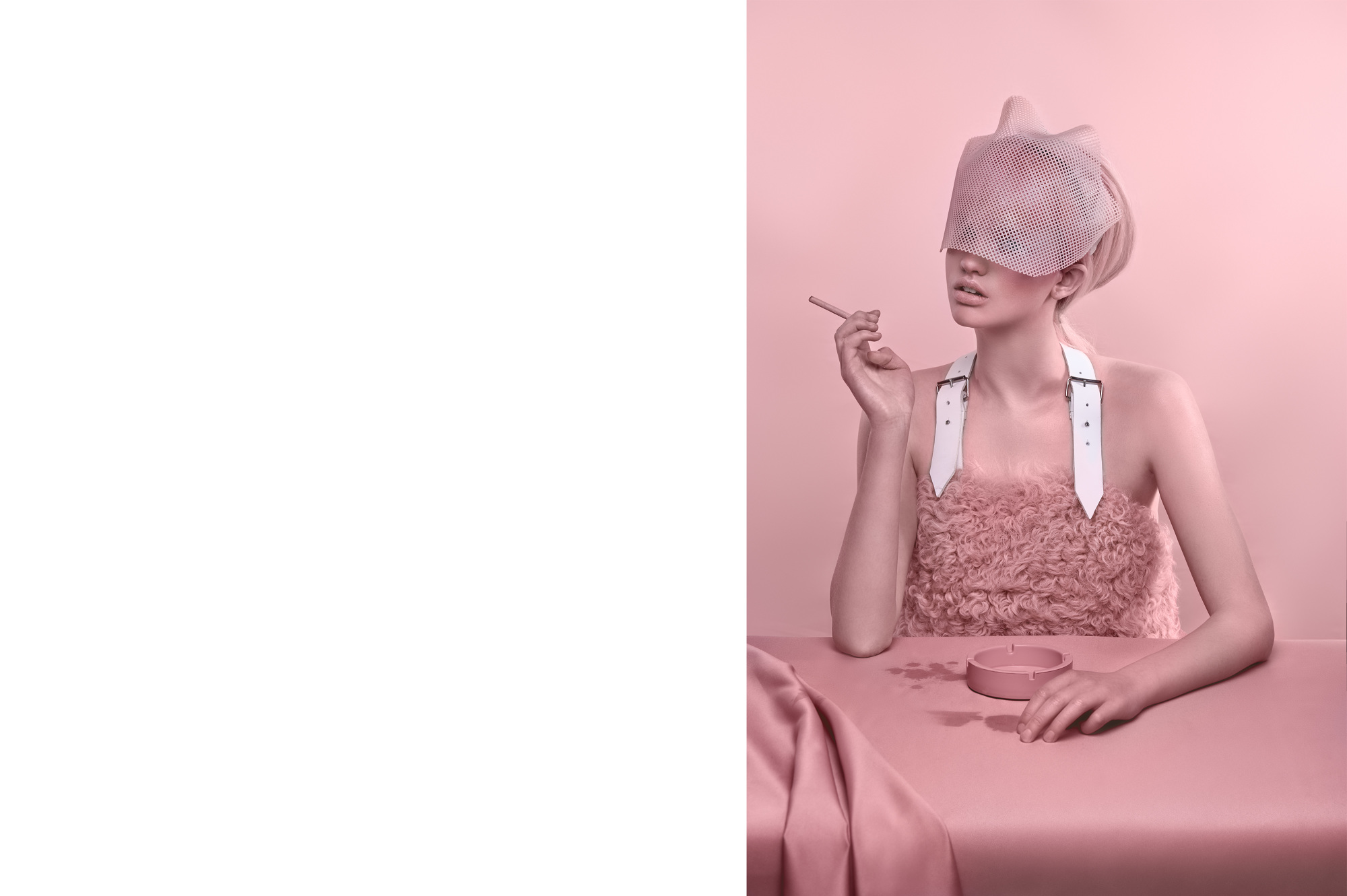
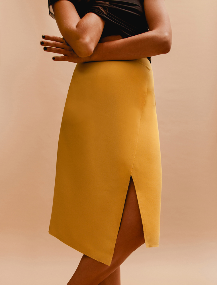
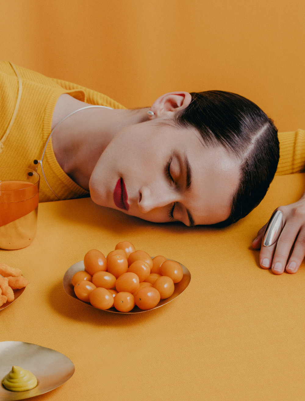
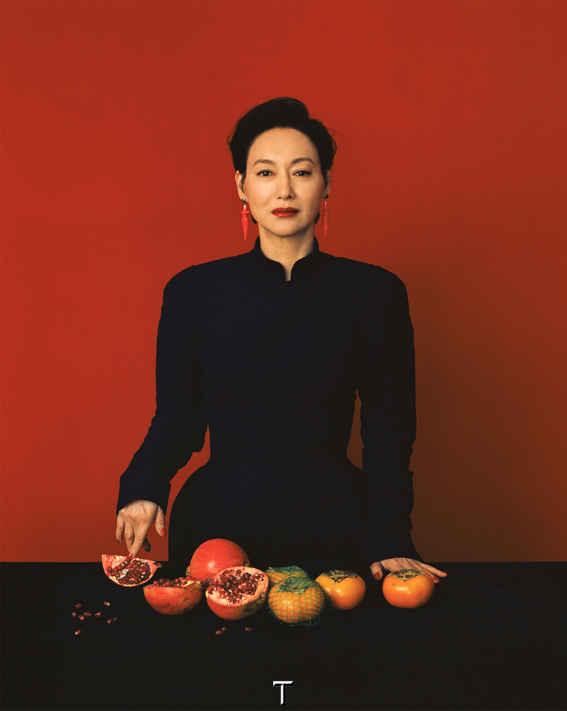
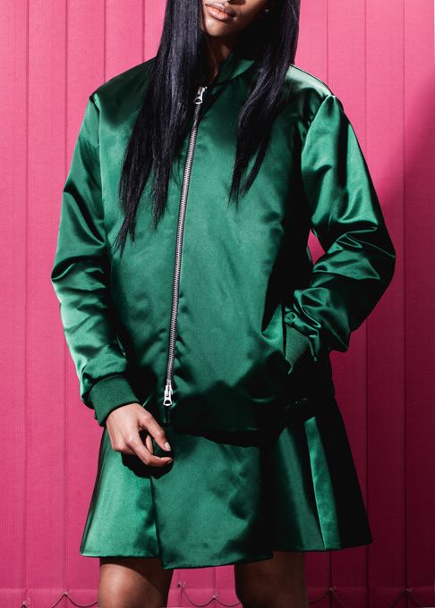
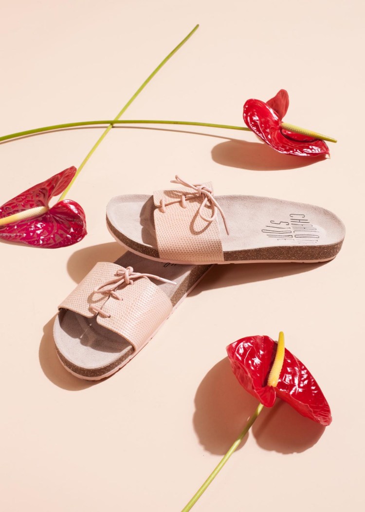
Ian Lanterman is a vancouver based contemporary fashion photographer who takes a similarly controlled approach to his use of colour as Mizrahi. Each image exists within a controlled colour palette. But through the other elements of the image - styling, setting, props, pose, the visuals are pared back.
The results are minimalistic portraits and still lives whose colour serves to accentuate the bold and stark shapes in his compositions. Lanterman aims for simple images with strong impact. F word magazine describes his work as being “clean and honest” - which seems an interesting label for something that is so produced.
Perhaps it is Lantermans approach to details - the creases in materials, natural textures, shadows cast by objects, that gives his work a slightly more authentic feel than Mizrahi’s surrealism. His work feels considered and sincere, even when the colour palette is sprightly and lively. the lack of movement in his subjects and careful staging of props suspend them in time and space.
This sense of visual inertia lend them a static certainty that moves us away from the atmospheric photography we usually associate with editorial fashion and makes them feel exceptionally modern, if a bit aromantic.
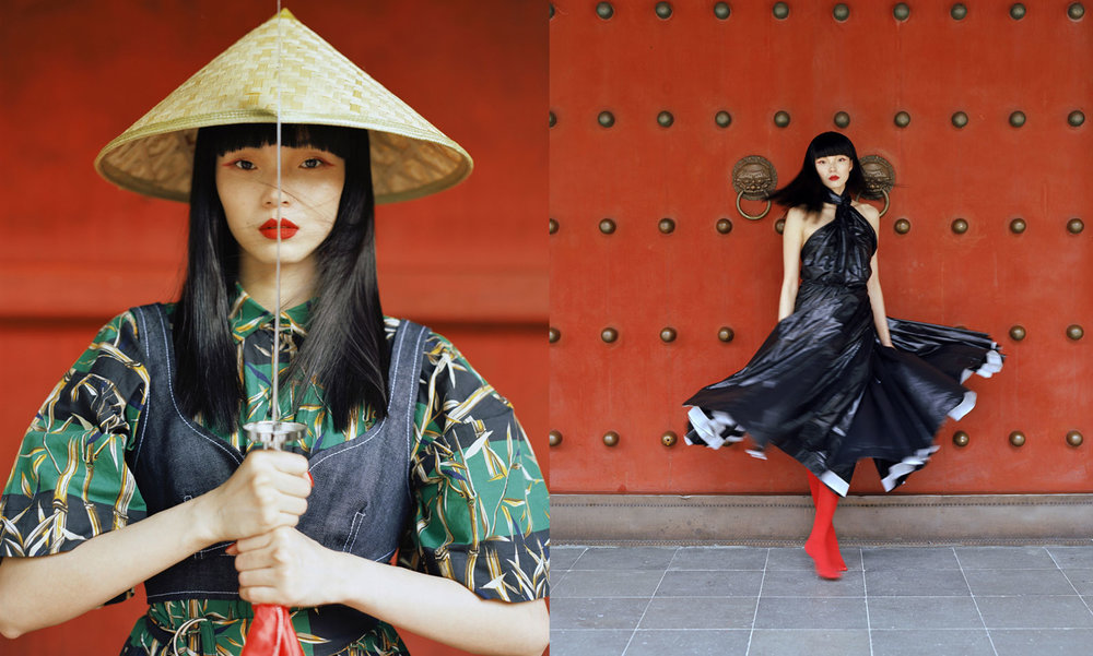
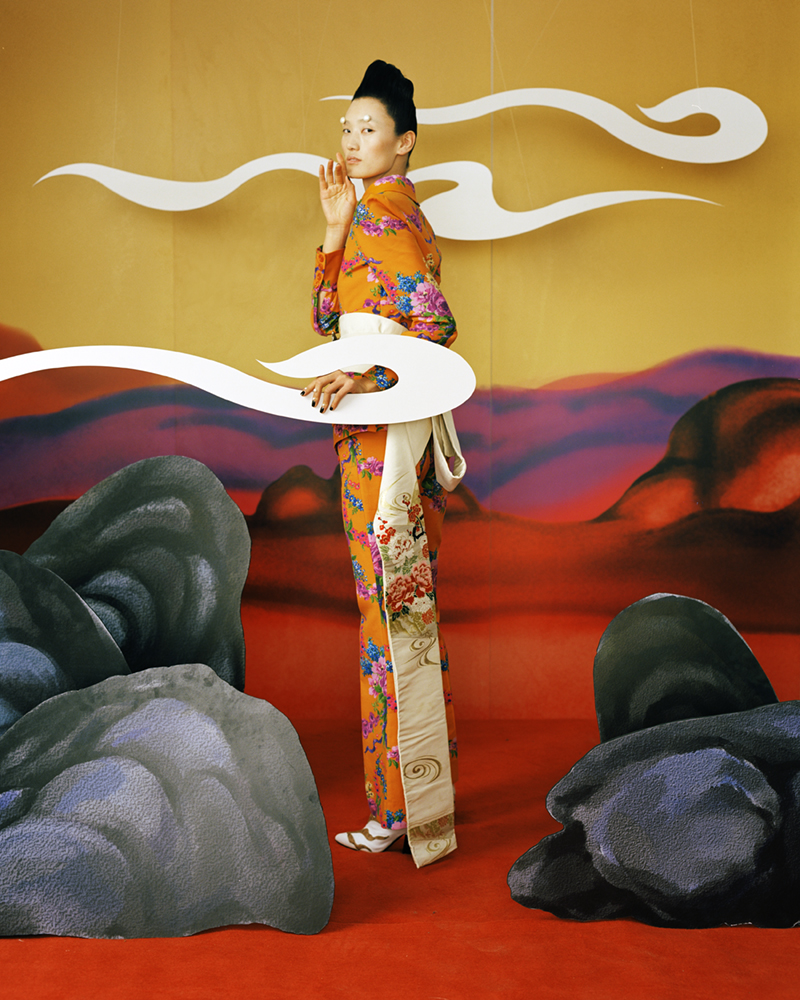
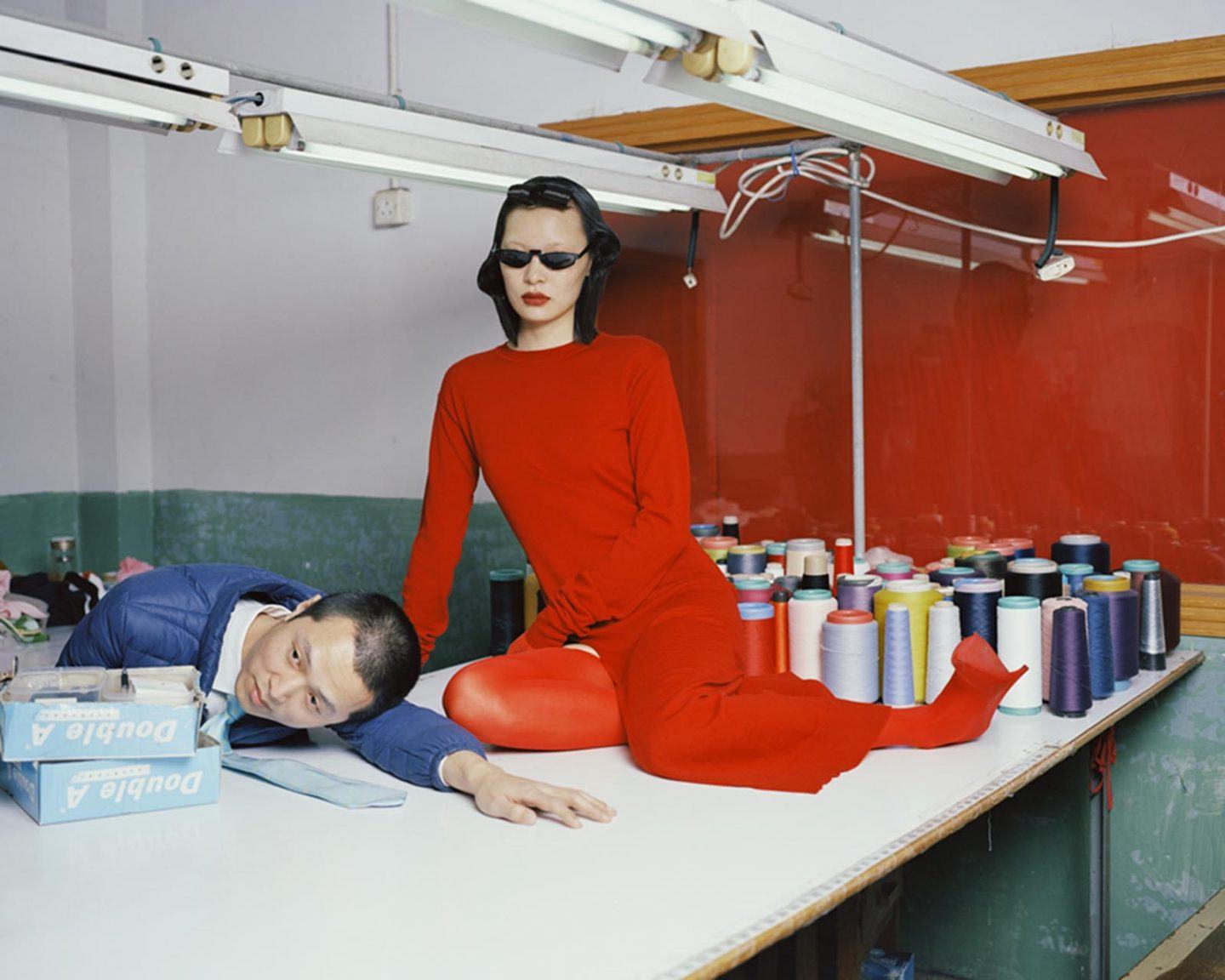
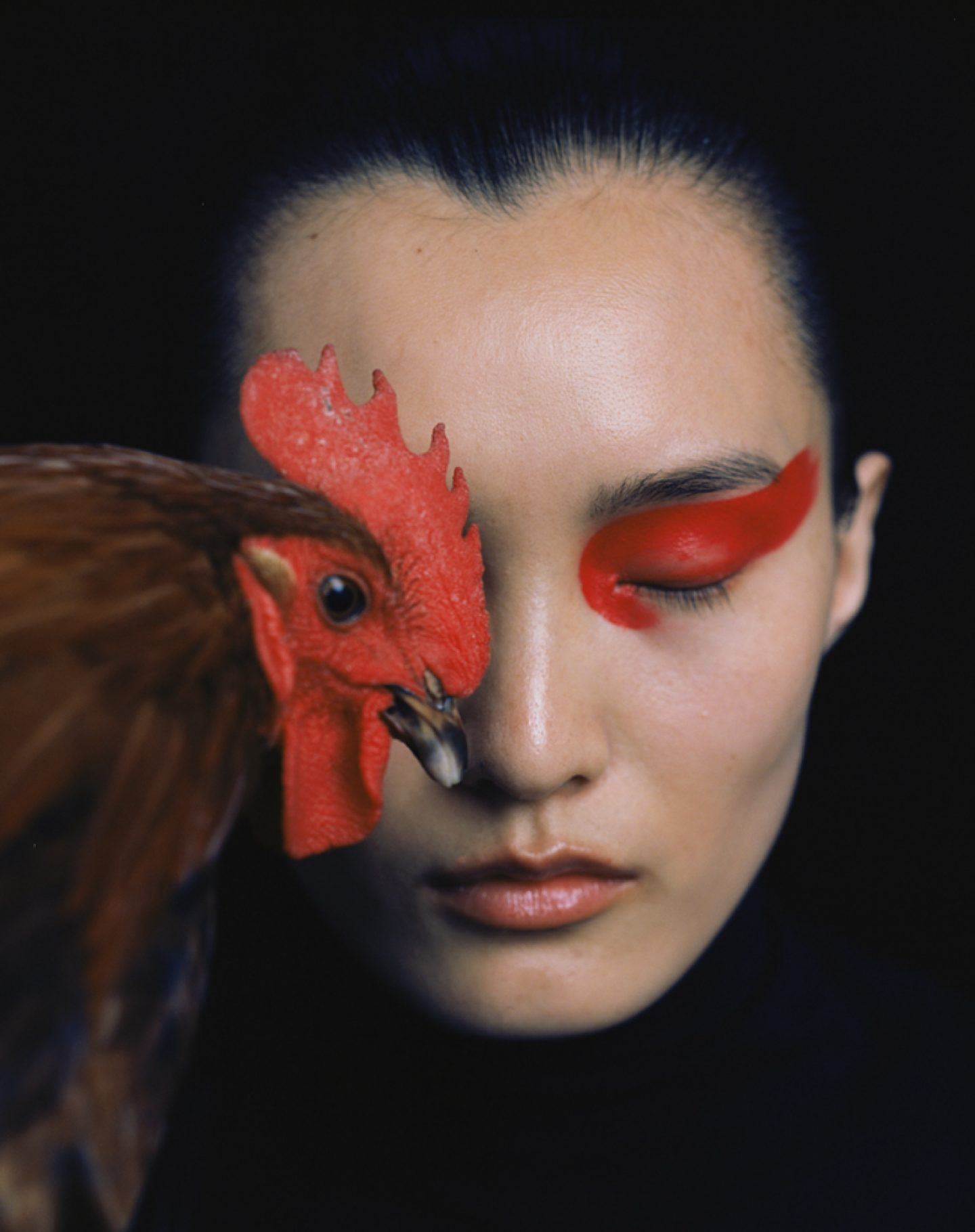
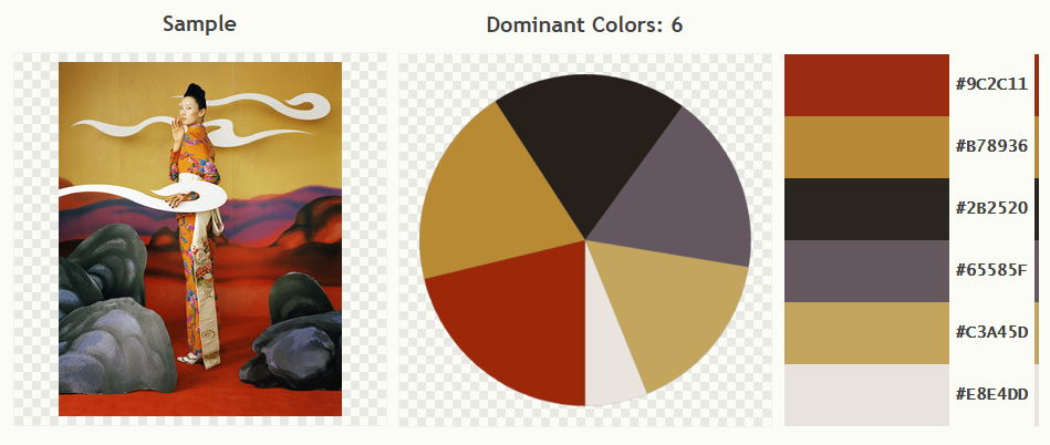
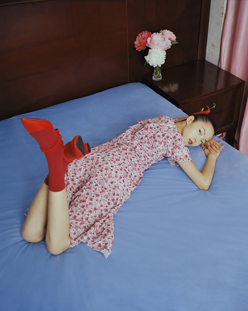
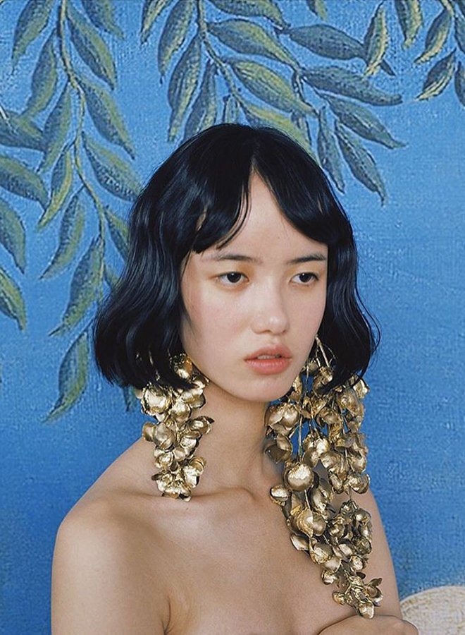
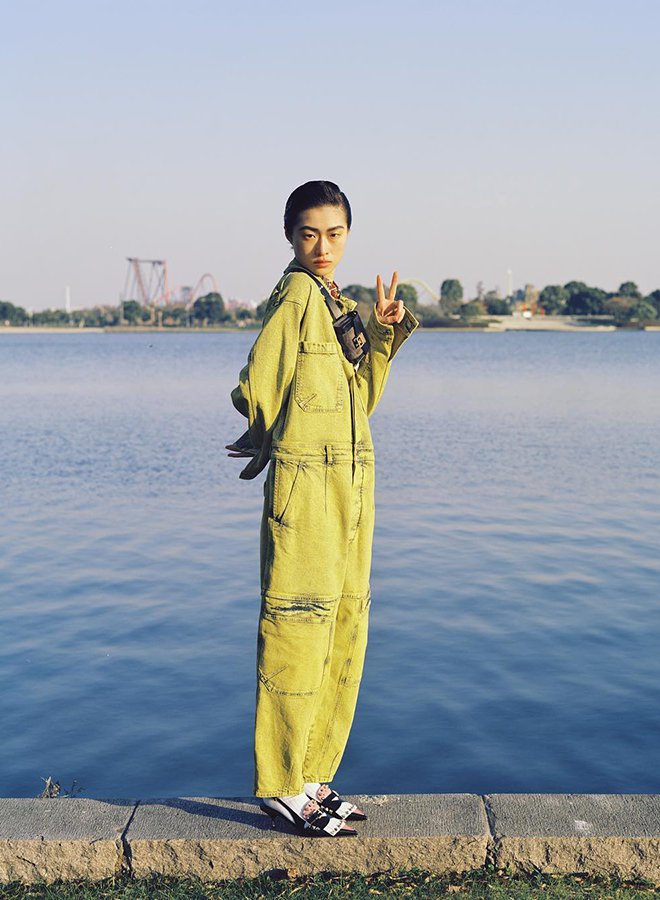
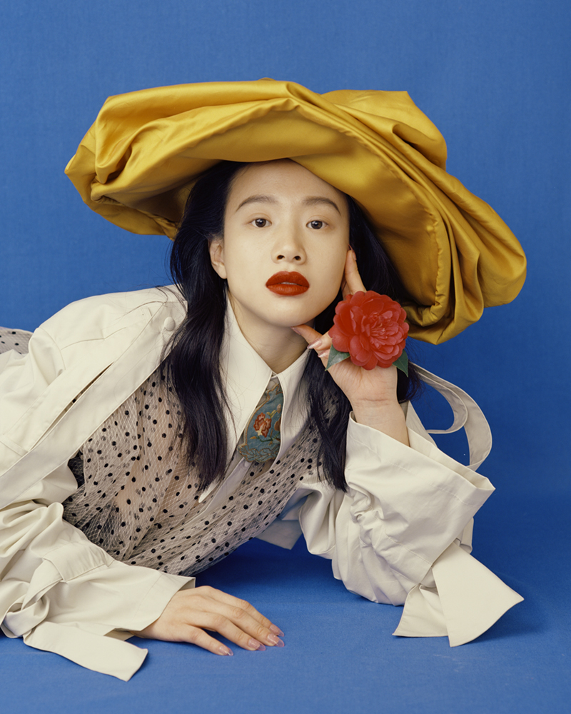
Leslie Zhang’s photographic work features bold colors, atmospheric documentary shots and stylized fashion commissions. His body of work is set to a backdrop of Chinese nostalgia. Notable visual influences include ancient artefacts spanning dynasties: lacquered red cabinets with gold inlay, carved trinkets made from cinnabar (which ranges in tone from a brownish terracotta red to a bright crimson red.)
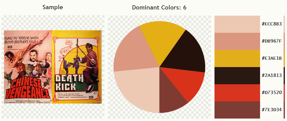
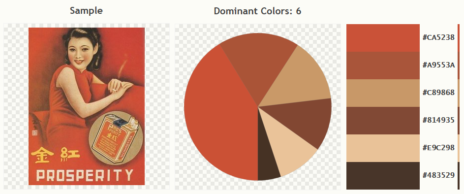
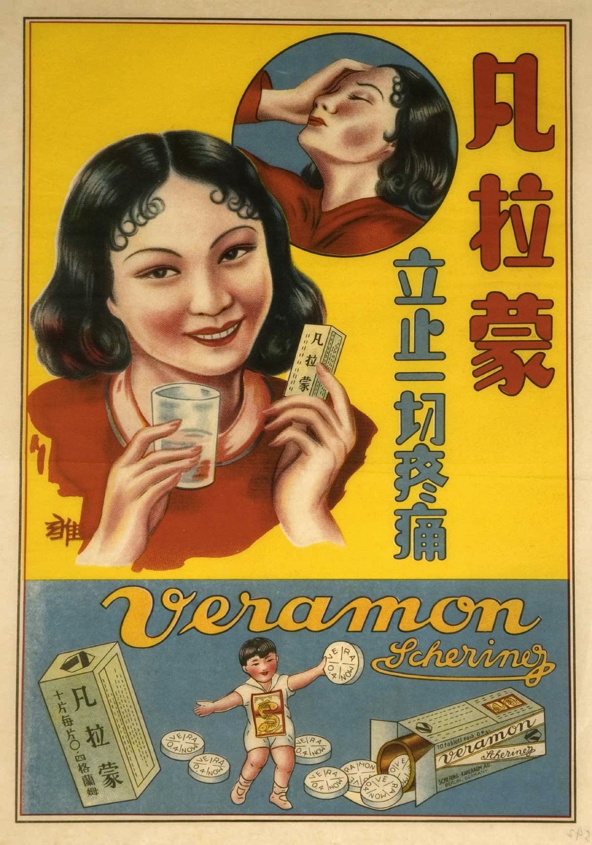
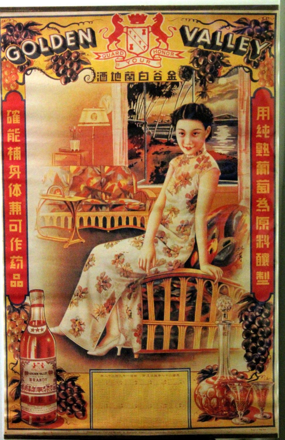
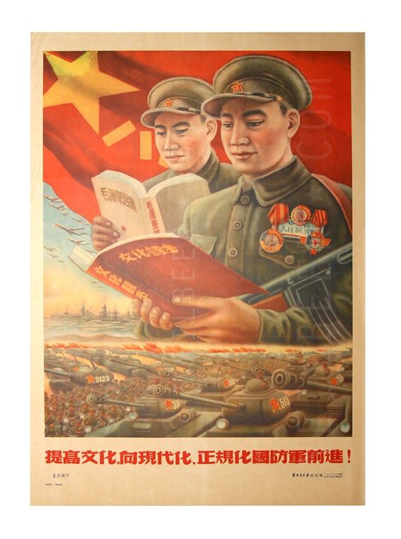
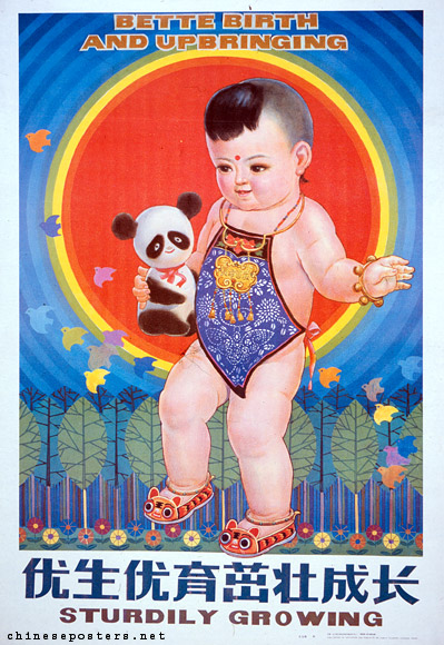
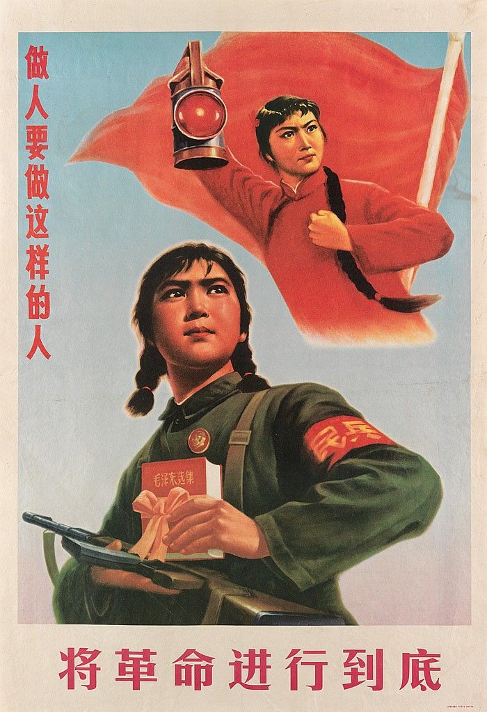
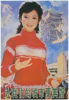
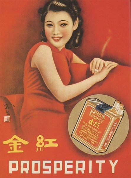
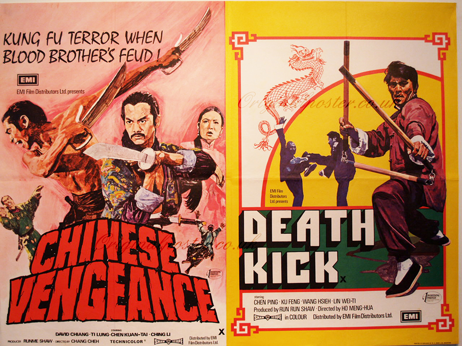
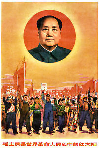
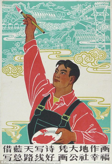
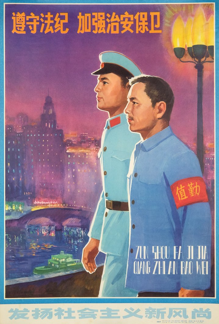
When you look at old chinese paper ephemera - particularly posters, some colours stand out more than others. Unsurprisingly, red is often the backdrop or dominant colour, and bright yellow accents are also common.
Chinese propaganda poster: Artist Unknown, ”Observe Law and Disclipline”, 1982.
Moving away from the more predictable reds and yellows, Zhang delves into the cold grayish blue. Blue represents the wood element in Chinese culture which relates to immortality, but the grayish-blue uniforms sanctioned by the communist party also have a crucial if controversial place in the country’s history.
Leslie Zhang, 2018.
It is a cold, clinical blue that pervades Zhang’s work. It sits against steely greys and neutral in this image, lifted only by the artificial greenery on the poster and accents of the dress’s print.
Here, once again it is the red element of the image that catches our eyes, while the blue stabilises and isolates it. The shade has a calmness about it, suspending the in time and space models and allowing their nude skin and dark hair to stand out even more against their backdrop. You can see in these images how Zhang uses bright pops of colour to keep the eye engaged as we scan across the image. The lighting and large spans of monochromatic colour give them a flattened sort of look.
“More and more so I’ve realized the things I have the deepest emotional connection to and find most beautiful, are the sentiments from my memories of growing up in China” Zhang explains.
Although the colour is largely divorced from its symbolism in Zhang’s work, the echoing of these colour combinations remains and when you look at his body of work as a whole, the influence of the chinese paper ephemera such as posters, postcards and advertisements is obvious.
The use of colour in visual art is always difficult to summarise. Much of the beauty of colour is that its meanings remains open-ended: A tool for artists and commercial photographers alike to interpret and use in their own ways. Colour photography was intrinsically linked to commercial imagery up until the 1980s, and the prejudice against the use of colour in editorial, portrait and fine art imagery has lasted well beyond that too.
The best summation of the role of colour photography today is by late photographer Edward Weston, who said “The prejudice many photographers have against colour photography comes from not thinking about colour as a form. You can say things with colour that can’t be said in black and white… Those who say that colour photography will eventually replace black and white are talking nonsense. They are different means to different ends.”
Colour and black and white photography are not part of the same artistic toolbox - they are two different media entirely.


